Ride-hailing app
Taxi Track
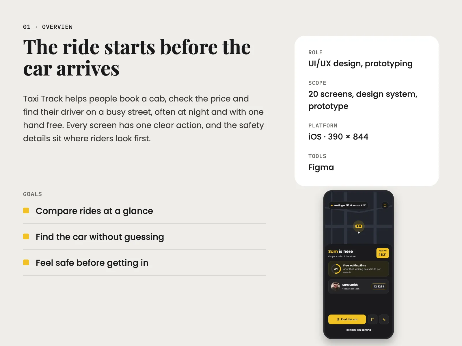
Taxi Track is an iOS app for booking a taxi, seeing the price before you go and finding your driver on a busy street, often at night. I designed it around the few minutes between booking and getting in, when riders have the most questions.
- Role
- UI/UX design, prototyping
- Platform
- iOS · 390 × 844
- Scope
- 20 screens, design system, prototype
- Year
- 2022–2023
01
The challenge
Before I started, I looked at how taxi apps handle the wait. Booking is usually quick. The worry comes after it: will the price change, which of these yellow cars is mine, and is the waiting fee already running? Most apps answer with a dot on a map and a plate number in small grey text. That doesn't help much when you're standing on a dark street with your phone in one hand.
A price you can't trust
When it's busy the price goes up, and riders don't know if it will go up again at drop-off.
Every taxi looks the same
On a busy street, a plate number and a dot on a map aren't enough to find the right car.
Is this really my driver?
Riders want to check the person and the car before they open the door.
Fees you don't see coming
Waiting and cancelling fees often start without a clear warning.
02
User flow
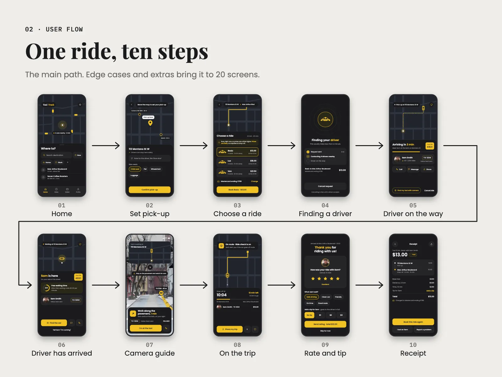
- 01Home
- →
- 02Set pick-up
- →
- 03Choose a ride
- →
- 04Finding a driver
- →
- 05Driver on the way
- →
- 06Driver has arrived
- →
- 07Camera guide
- →
- 08On the trip
- →
- 09Rate & tip
- →
- 10Receipt
03
Key decisions
- 01
The price on the button
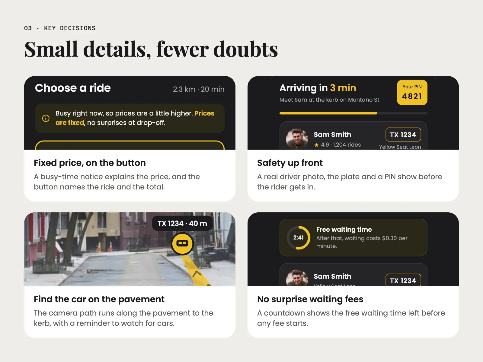
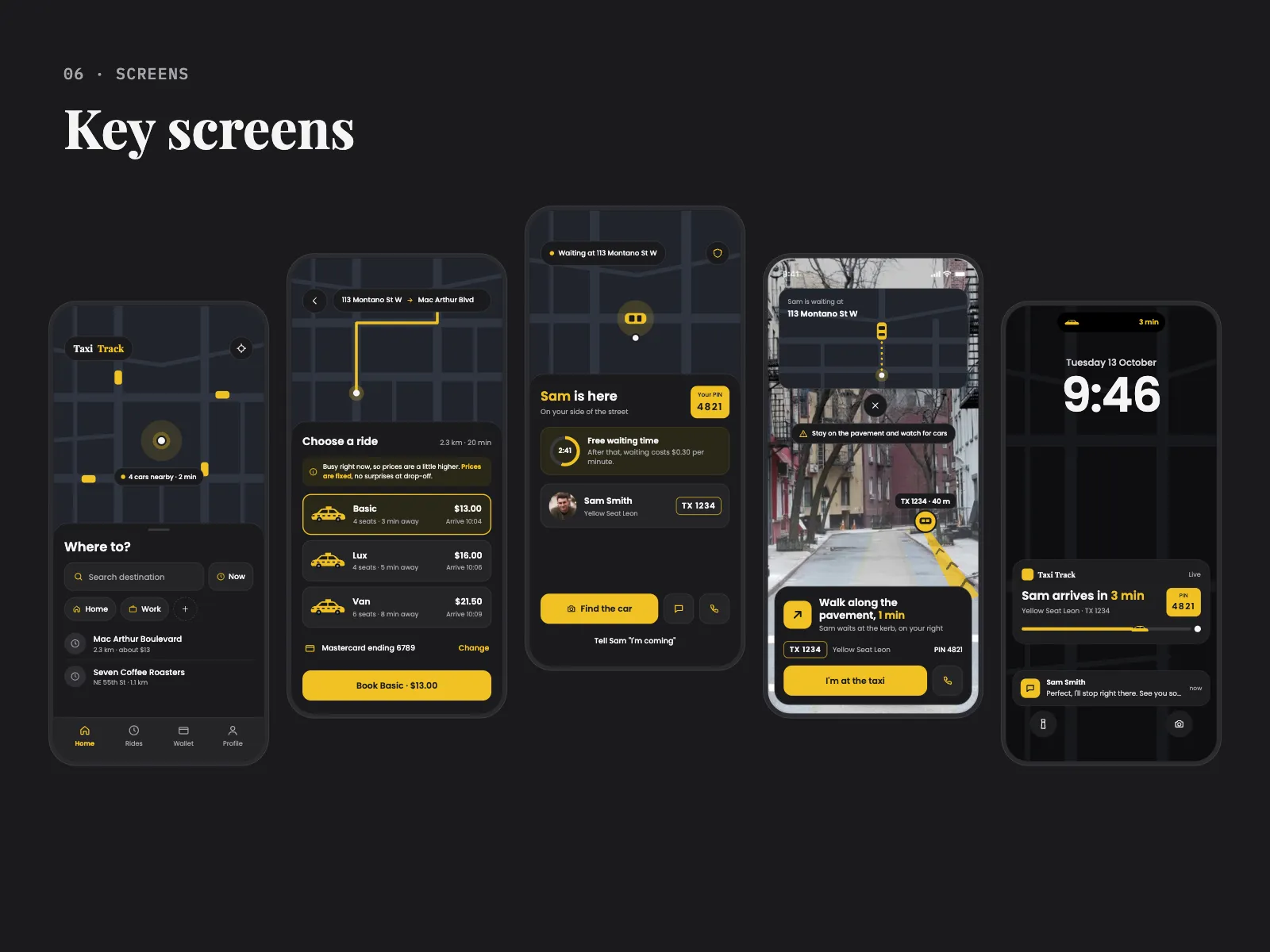
On Choose a ride, Basic, Lux and Van each show seats, how far away the car is, the arrival time and one fixed price. When it's busy, a yellow note says prices are a little higher and that they're fixed, so there are no surprises at drop-off. The button then repeats the choice: Book Basic · $13.00. I didn't want to hide the busy price, because people notice it anyway. Saying it plainly costs a line of space, and it's the line people actually read.
- 02
Safety details at the top
When the driver is on the way, the top of the sheet says Arriving in 3 min next to a yellow PIN, 4821. Under it are Sam's photo, his rating and number of rides, the plate TX 1234 and the car, a Yellow Seat Leon. The plate sits in a box with a yellow outline, like a real plate, so it's easy to match with the car. The PIN is the biggest number on the screen on purpose. The map got smaller to make room, and I was fine with that, because at this point you need the person more than the route.
- 03
A camera guide to the car
On a busy street the map isn't enough, so Find the car opens the camera. A yellow path runs along the pavement to the kerb, with TX 1234 · 40 m above the car and Walk along the pavement, 1 min below. A small map stays at the top so you don't lose your bearings. Looking at a camera while you walk is a risk, so the screen says Stay on the pavement and watch for cars, and the close button and I'm at the taxi get you out of it quickly.
- 04
Free waiting time you can see
When Sam is here, a ring counts down the free waiting time, 2:41 on the screen, and the text says what it costs after that: $0.30 per minute. I put the time before the fee, so the first thing you read is how long you still have. Under it is Tell Sam “I'm coming”, one tap to let the driver know you're on your way.
- 05
Clear answers when things go wrong
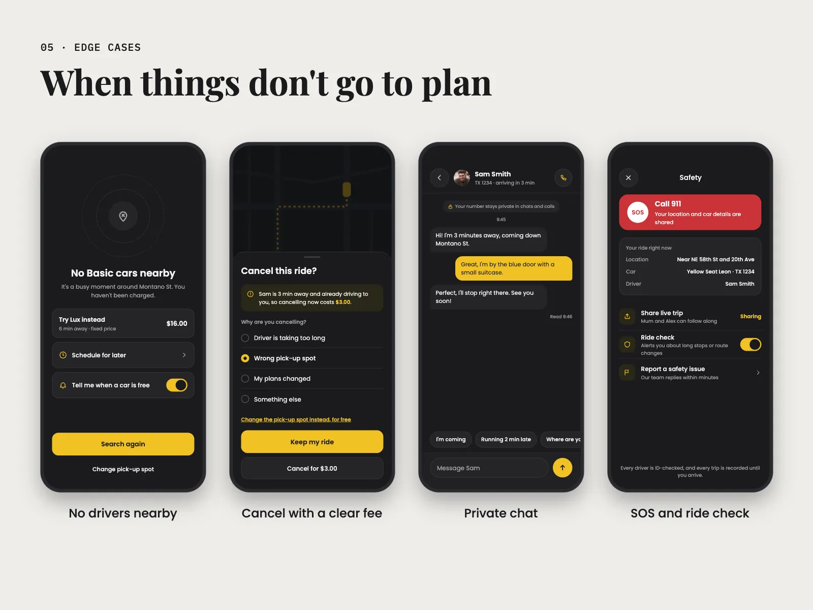
I designed the bad moments as carefully as the main path. If there are no Basic cars, the screen says you haven't been charged and offers Lux for $16.00, Schedule for later or Tell me when a car is free. If you cancel after the driver has set off, the sheet says it now costs $3.00, and the main button is Keep my ride, with a free option to change the pick-up spot instead. That meant more screens, 20 in all for a 10 step ride. These are the moments when people stop trusting an app, so I thought they were worth it.
- 06
Help that stays close
Chat with the driver has quick replies like I'm coming and Running 2 min late, and a note that your number stays private. The shield at the top of every ride screen opens Safety: a red Call 911 button that shares your location and car details, then Share live trip, Ride check and Report a safety issue. Red appears only there, so it never gets lost among the yellow. When the phone is locked, the lock screen still shows Sam arrives in 3 min, the plate and the PIN.
04
Design system
Taxi Track is dark, with one taxi yellow for buttons, the PIN, the route and anything you need to act on. A dark map is easier on the eyes at night and makes the yellow cars stand out. Because the yellow does so much work, I kept it off decoration. Red appears once, on the SOS button. Text is set in a round, simple sans, cards and buttons have soft corners, and plates sit in outlined boxes so they look like the real thing. The name Taxi Track uses a serif, which gives the brand a bit of character next to the plain interface.
05
Final screens
06
Next steps
Next, I'd take the camera guide outside at night and see if people can follow the path and still watch the street. I'd also check whether riders notice the PIN and use it, or skip it. After that I'd add bigger text and voice guidance for people who can't look at the screen while they walk.
Next project