Therapy scheduling web app · Client project
Journey ABA
Journey ABA offers therapy for children at home, in Massachusetts, New Hampshire and Rhode Island. I designed their scheduling app with TGN Solutions from the first version in 2023. Coordinators use it to find the right therapist for every child and to plan each therapist's day. The screens here are that work, redesigned in 2026.
- Client
- Journey ABA · with TGN Solutions
- Role
- UI/UX design
- Platform
- Web, back office
- Year
- 2023 · Redesign 2026
01
The client and the problem
When I joined, nothing had been built yet. There was a first draft: a dark admin screen with tables of names, a few options and long forms to fill in. To plan one child's week, a coordinator would compare two availability tables, the child's and the therapist's, line by line. I redesigned it completely, and the build started from my designs. We were in touch with the Journey ABA team the whole time, and they were clear about what mattered most: availability. Who is free, when, and for how long. Every week each child needs a therapist with the right certificate, at a time that fits around school, without the therapist spending half the day in the car. Matching was the hardest part, because all of that has to be true at once.
Approved hours
Each child has a number of therapy hours approved by insurance, and all of them should be used.
The right therapist
Some sessions need a BCBA, others a behavior technician.
School and family time
Sessions have to fit around school and the family's week.
Driving
Therapists drive from home to home, so the route decides how many sessions fit in a day.
02
User flow
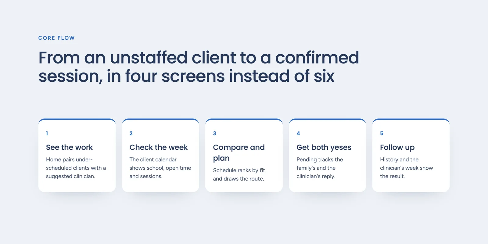
- 01See the work
- →
- 02Check the week
- →
- 03Compare and plan
- →
- 04Get both yeses
- →
- 05Follow up
03
Key decisions
- 01
From two tables to one week
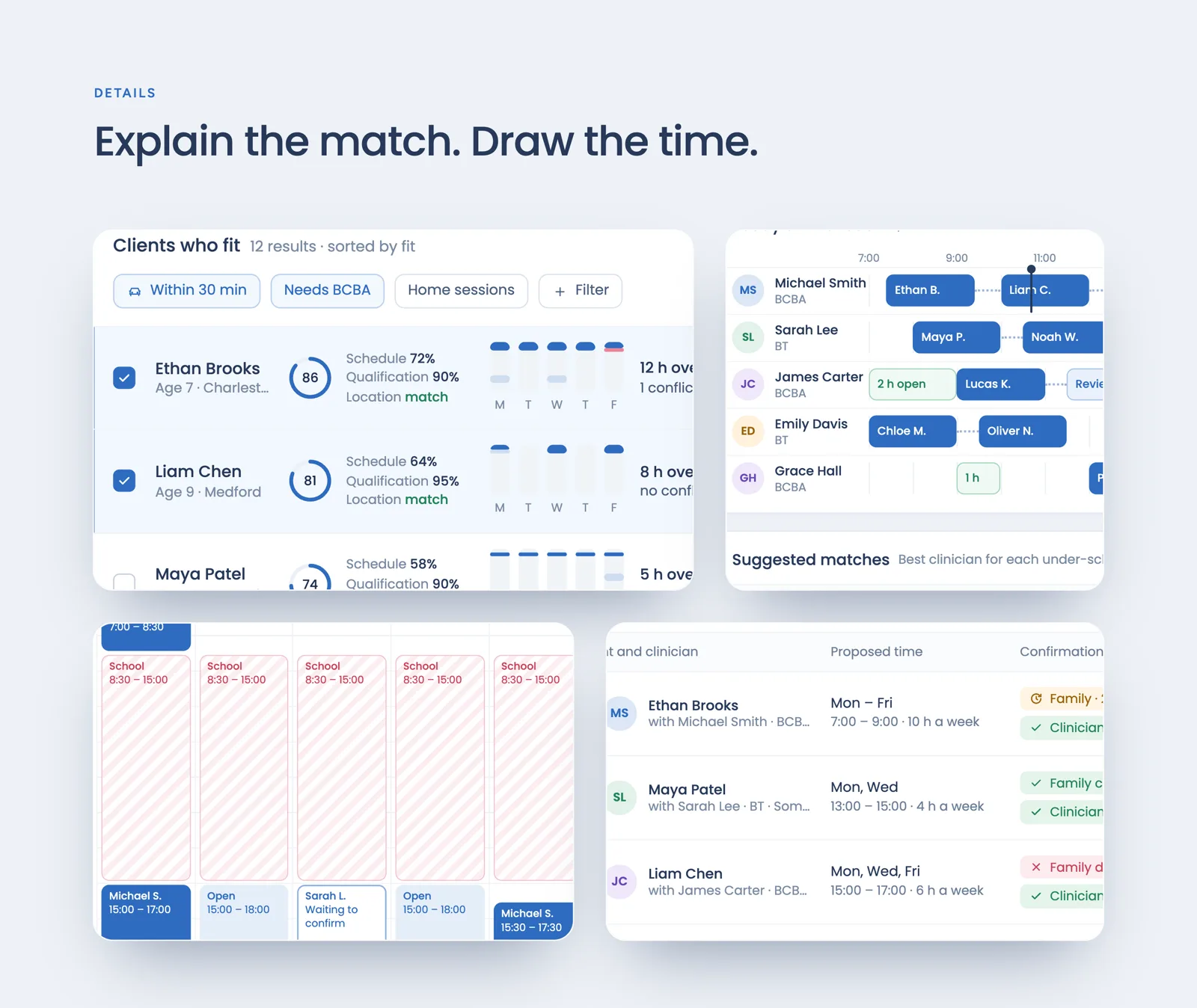
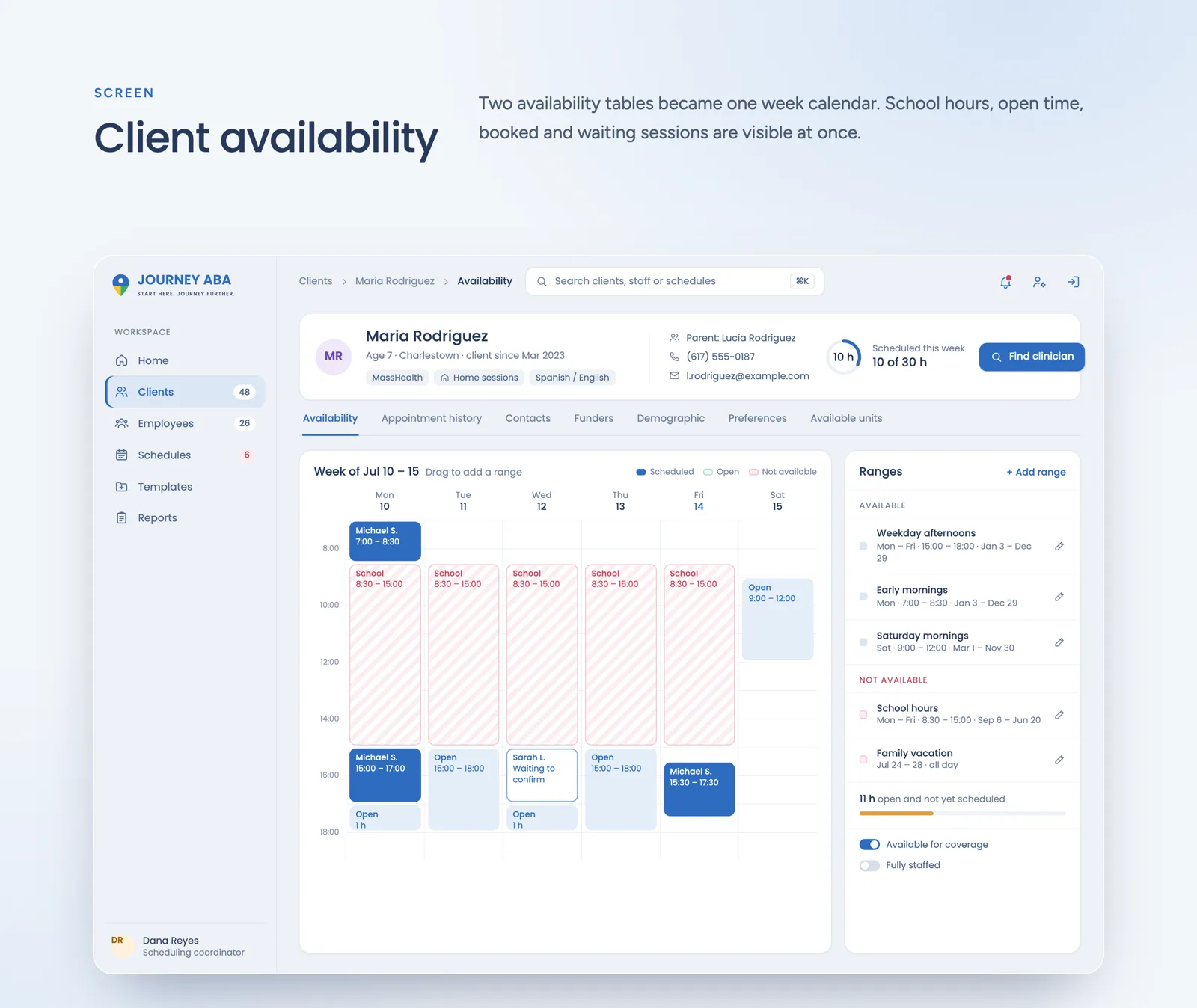
In the first version a child's availability and a therapist's lived in two tables, and the coordinator compared the rows by eye. I turned the child's week into one calendar. School hours are striped red, 8:30 to 15:00, open time is light blue, booked sessions are solid blue, and a session waiting for an answer has only an outline, like Sarah L. waiting to confirm on Wednesday. Ranges such as Weekday afternoons or Family vacation sit on the right, and you can drag on the calendar to add a new one. A calendar takes more room than a table. The team asked for availability above everything else, though, and in a calendar a free afternoon is something you see, not something you work out.
- 02
A score that shows its working
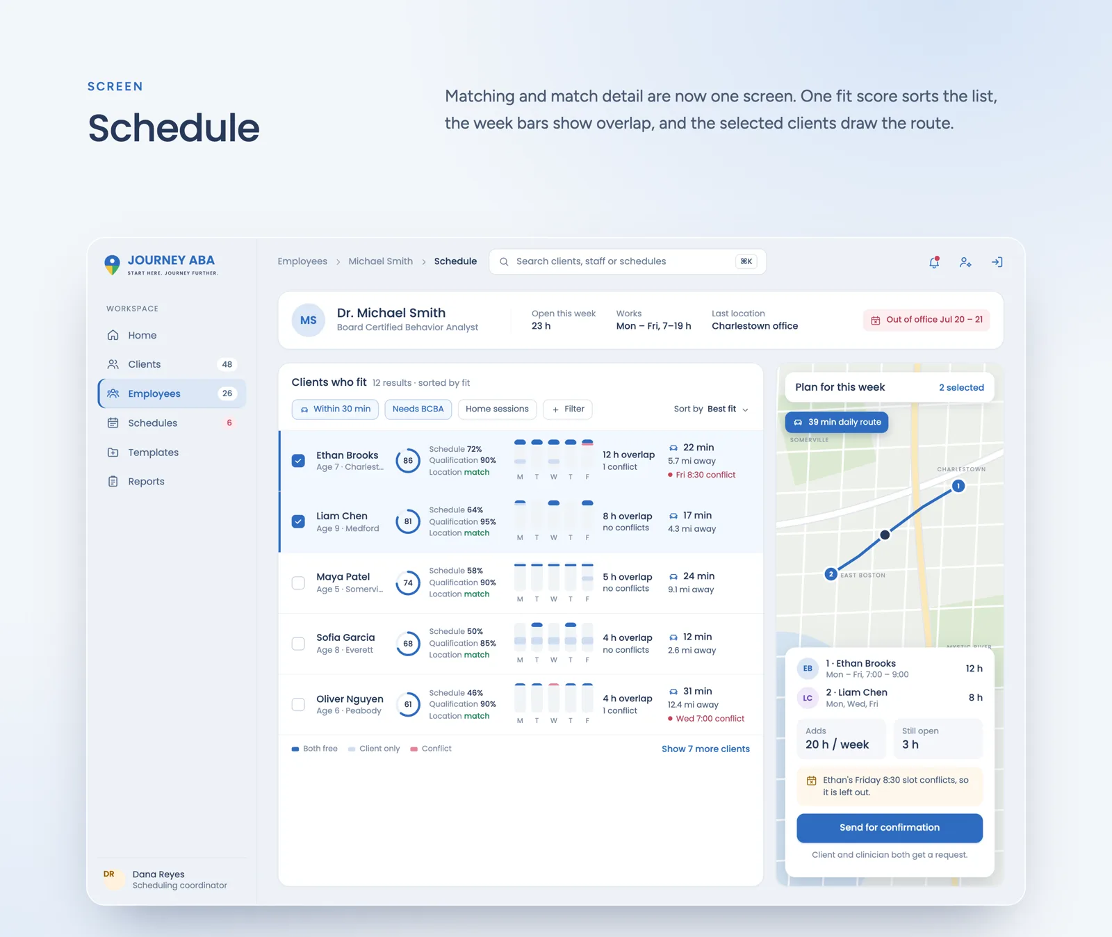
A single number like 86 doesn't tell a coordinator why a child fits. So next to every score I split it into three parts: Schedule 72%, Qualification 90% and Location match. Beside it, small bars for Monday to Friday show where the child and the therapist are both free, and a red mark shows a conflict, like Fri 8:30. The score only sorts the list. The reasons are there so the coordinator can disagree with it, because they know things about a family that the system doesn't.
- 03
Match and detail on one screen
Before, you picked a child on one screen and checked the details on another, then went back. Now the clients who fit, their week bars and the map are on one Schedule screen. Ticking Ethan Brooks and Liam Chen draws their route on the map, a 39 min daily drive, and adds up the hours: 20 h a week added, 3 h still open. If a slot clashes, the plan says it in one sentence: Ethan's Friday 8:30 slot conflicts, so it is left out. It is a dense screen. I accepted that, because coordinators spend most of their day here, and one full screen is easier than three light ones you have to remember between.
- 04
Each therapist's day as a route
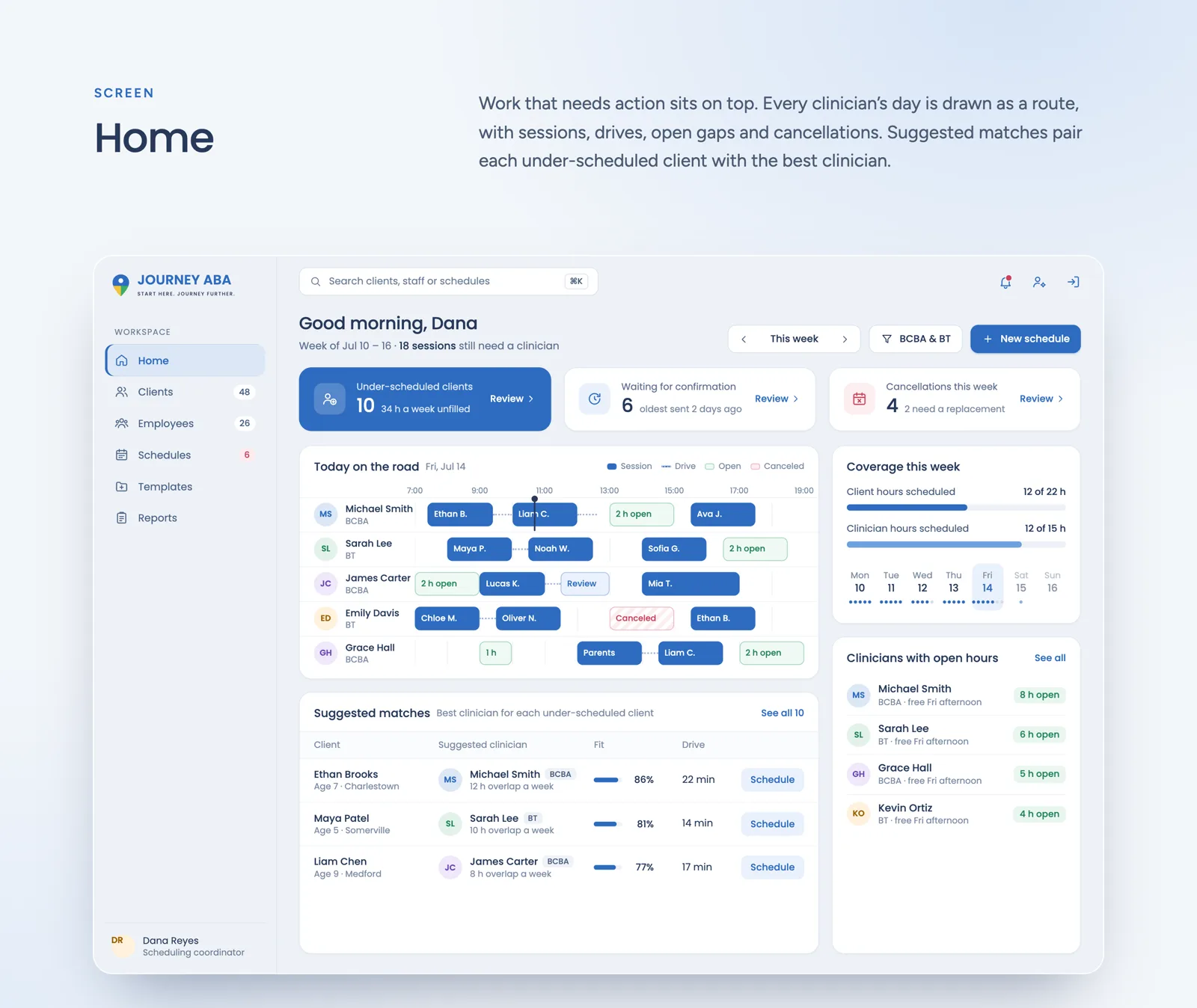
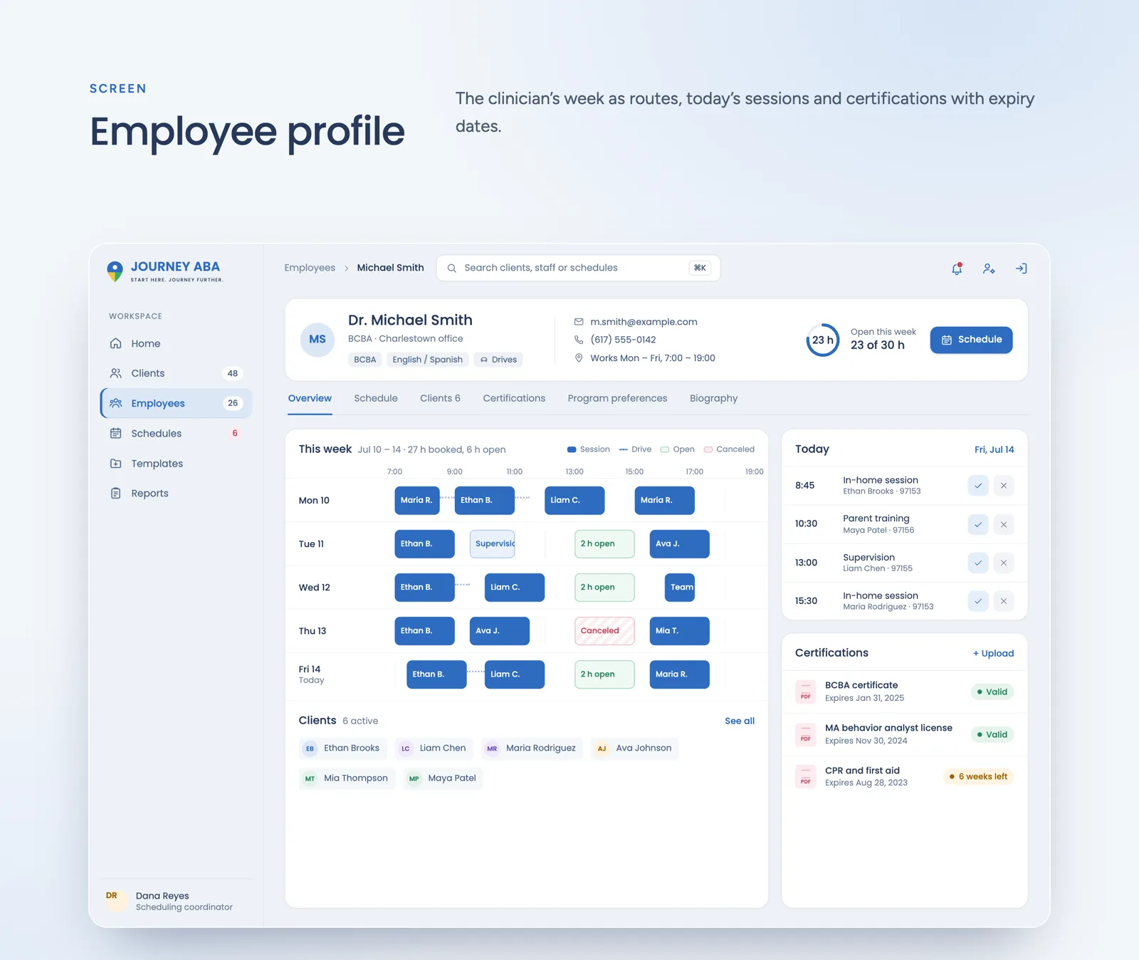
On Home, every therapist's day is one line from 7:00 to 19:00. Sessions are blue blocks, drives are dotted lines, open gaps are green and cancellations red. Therapists drive from home to home, so a free hour in the morning and one in the afternoon are not the same as two free hours together. A line shows that, a table doesn't. Above it sits only what needs action today: 10 under-scheduled clients, 6 schedules waiting for confirmation, 4 cancellations.
- 05
Filters in the team's own words
The filters above the list are the questions coordinators kept asking in our calls: Within 30 min, Needs BCBA, Home sessions. They are chips you tap, not fields in a form. The first version had a form for almost everything, and filling one in just to ask a simple question slowed people down. A few fixed chips can't cover every case, so a Filter button is still there for the rest.
- 06
Two yeses before it's final
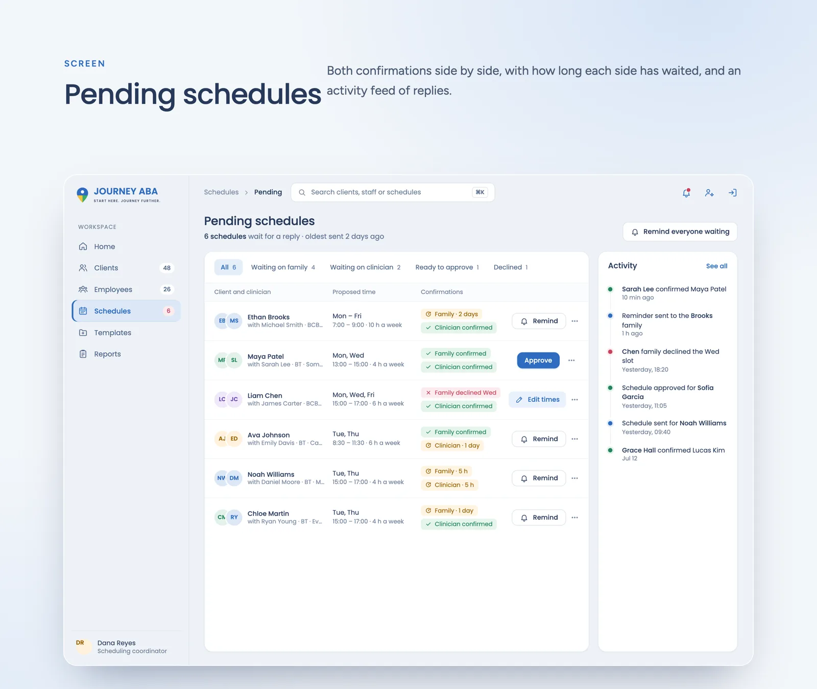
A session isn't booked when the coordinator sends it. The family and the therapist both get a request, and Pending schedules shows both answers side by side with how long each has waited, like Family · 2 days. When the Chen family declines Wednesday, that row turns red and its button changes from Remind to Edit times. An activity feed on the right lists every reply. Waiting for two people is slower, but it means nobody turns up for a session the other side never agreed to.
04
Design system
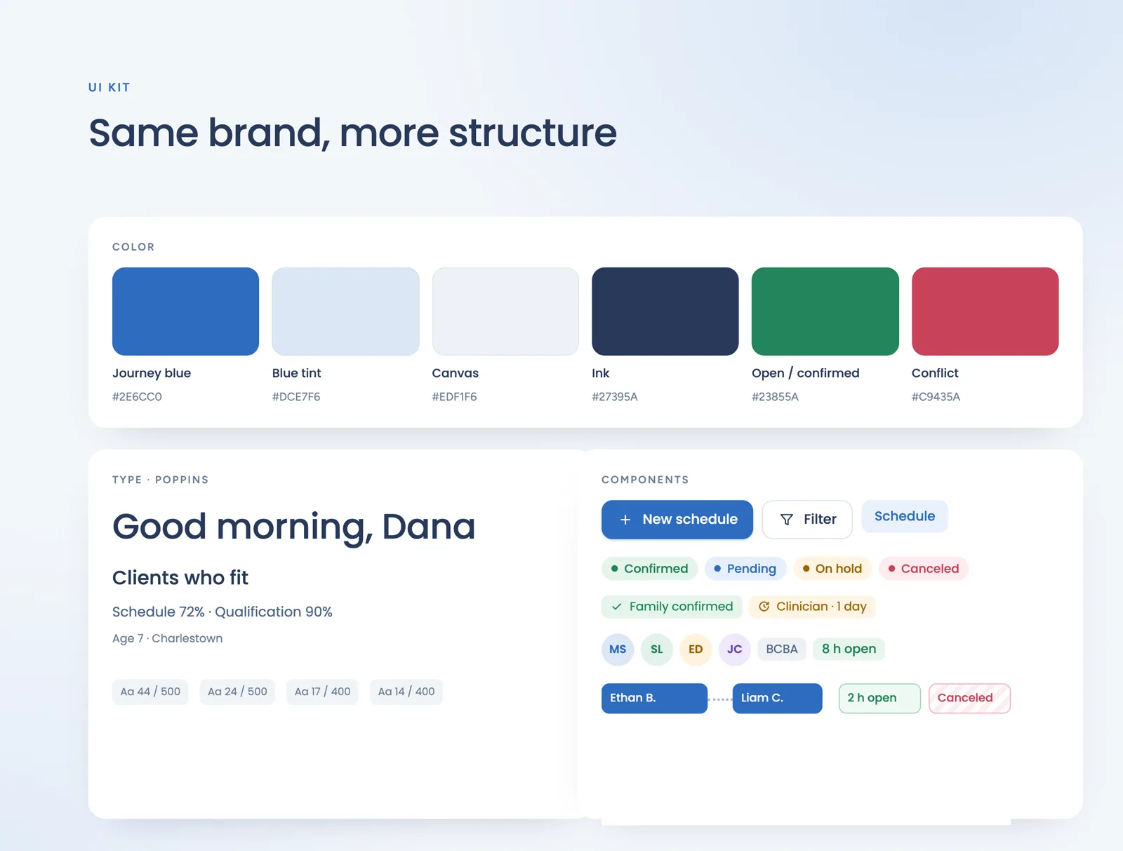
I kept the Journey ABA blue and the Poppins font from their brand, and moved the app from the old dark theme to a light background, which is easier on the eyes for a whole day of tables and calendars. Colours only carry meaning: blue for actions and sessions, green for free time and confirmations, red for conflicts, school hours and cancellations. Blocked time is striped, so school hours never look like a cancellation.
05
Final screens
06
Outcome
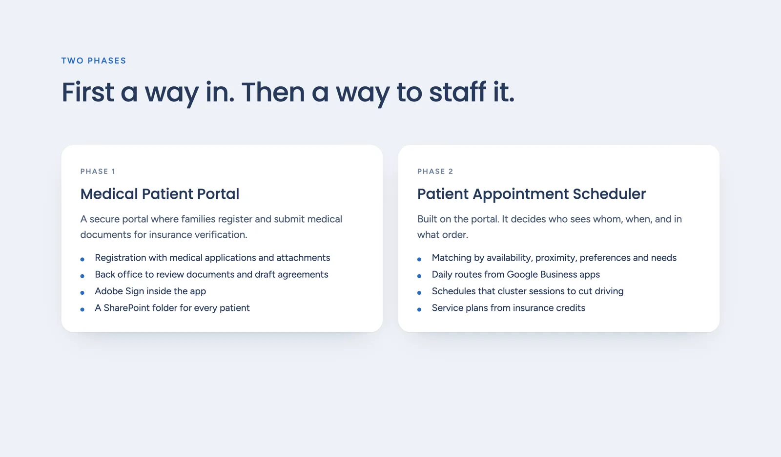
While we worked together, the Journey ABA team was happy with how the scheduler solved these problems. The product was built in two parts. First a secure portal where families sign up and send documents for insurance, then the scheduler you see here. All names, places and numbers on the screens are sample data.
Next project