Pet care app · iOS & Android · Client project
Maza
Maza is a pet care app I designed for Maza Dogwear, a dog clothing brand from Banja Luka. It keeps everything about your dog in one place: vet visits, medicine reminders, dog-friendly places nearby, a dog age calculator and a message wall for other owners. Besides the app, I designed its website and the admin panel the team uses to run it.
- Client
- Maza Dogwear, Banja Luka · with Atomic Solutions
- Role
- UI/UX design
- Platform
- iOS, Android, website, admin panel
- Year
- 2024–2025
01
The challenge
Most dog owners keep their dog's information everywhere: on the vet's paper card, in a notes app, in group chats and in their head. Reminders get missed, and with two dogs you write everything twice. For the owner of Maza Dogwear the app was also personal. She wanted it to be beautiful and to last, something made in honour of her own dog, so how it looks was part of the brief from day one, not a finishing touch. The developer from Atomic Solutions and I sat down with her at the start. She told us what she needed, we talked it through, and from then on the two of us brought her directions for where the app could go.
All over the place
Vet visits, vaccines and medicine are on paper cards and in notes.
One dog at a time
Most reminder apps make you add the same event for each dog.
Where can we go?
Finding cafés and parks that allow dogs means guessing or asking around.
Not another feed
Likes and endless scrolling don't fit a small community of dog owners.
02
User flow
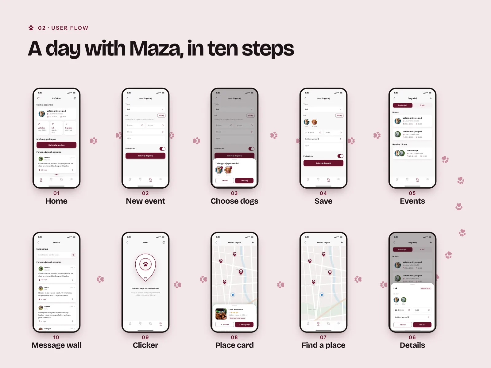
- 01Home
- →
- 02New event
- →
- 03Choose dogs
- →
- 04Save
- →
- 05Events
- →
- 06Details
- →
- 07Find a place
- →
- 08Place card
- →
- 09Clicker
- →
- 10Message wall
03
Key decisions
- 01
Pick dogs by photo
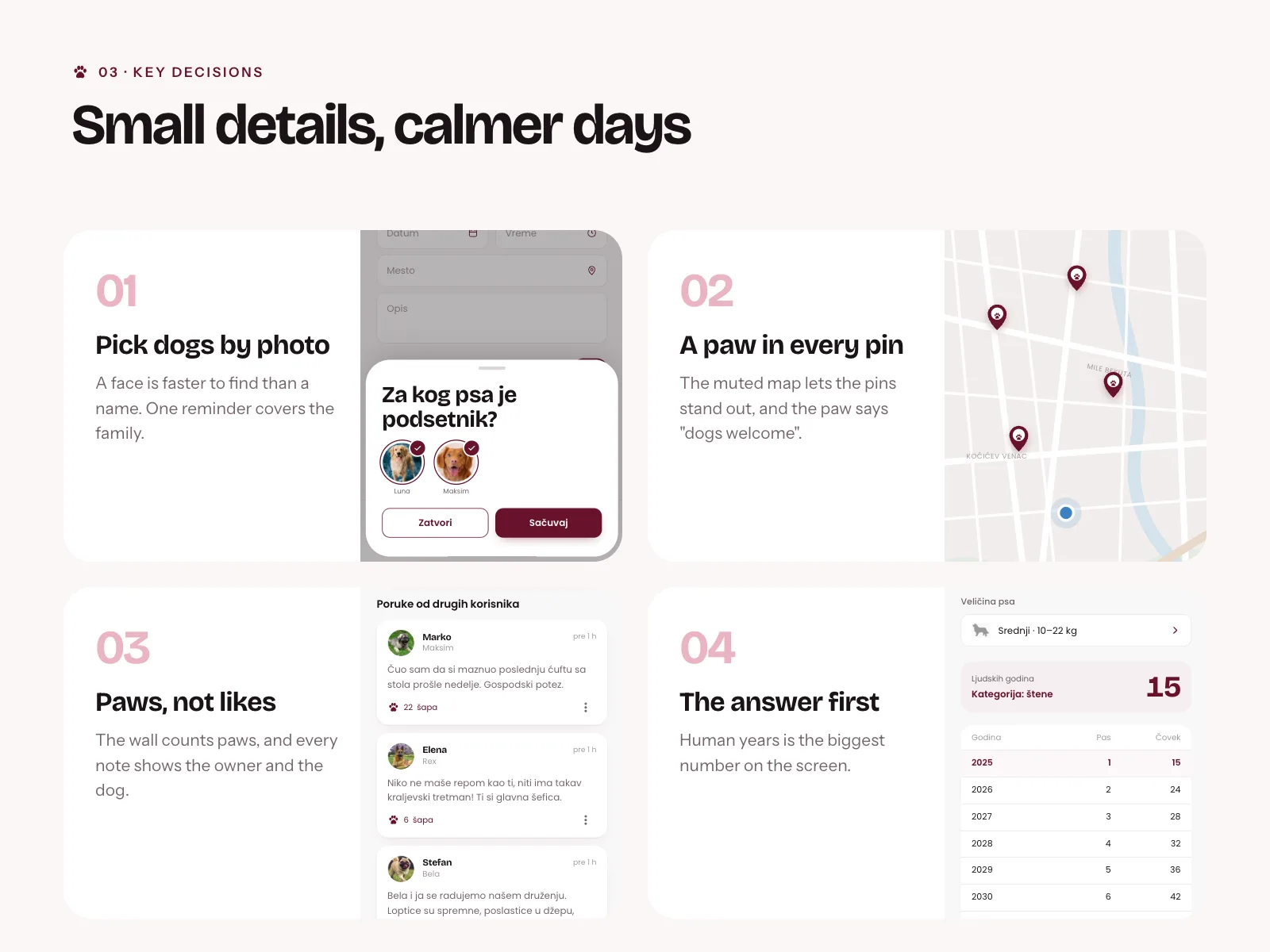
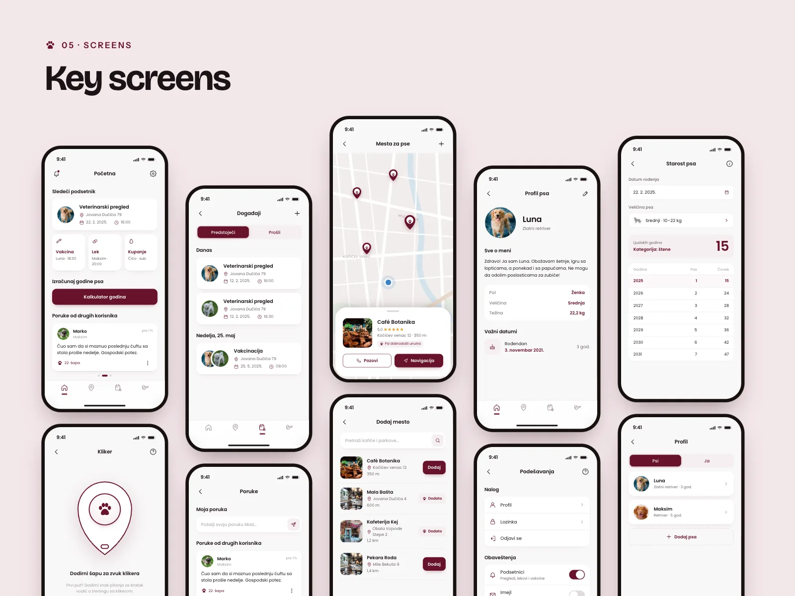
When you add a reminder, a sheet asks Za kog psa je podsetnik?, which dog is this for, and shows your dogs as round photos, Luna and Maksim, with a tick on each one you choose. A face is faster to find than a name, and one reminder can cover the whole family, so a vaccination for two dogs is one event, not two. Photos take more room than a list of names, but in an app about your dog, nobody minds seeing its face.
- 02
The next thing comes first
Home opens with Sledeći podsetnik, the next reminder: a vet check at Jovana Dučića 79, 22. 2. 2025 at 16:00, with the dog's photo next to it. Under it sit three small cards for vaccine, medicine and bath, then the age calculator and the messages. People open an app like this to see what's coming, so that goes on top, and everything else can wait further down.
- 03
A paw in every pin
I kept the map muted so the burgundy pins stand out, and each pin has a paw in it, which already says dogs are welcome. Tapping one opens a small card, like Café Botanika, 5.0, 350 m away, with a note that dogs are welcome inside and two buttons, Pozovi to call and Navigacija for directions. Owners can add places themselves by searching cafés and parks, so the map grows with the community instead of waiting for us to fill it.
- 04
Paws instead of likes
The message wall is short notes from other owners, and every note shows both the owner and the dog, like Marko with Maksim. Instead of likes, people give paws, 22 šapa. It's a small change, but it keeps the wall about dogs and makes it feel like a neighbourhood, not a social network. Your own message sits on top with a switch, so you decide whether it's shown.
- 05
The answer is the biggest number
The age calculator asks for the birthday and the size, Srednji, 10 to 22 kg, because dogs of different sizes age at different speeds. The result, 15 human years, is the biggest number on the screen, with the life stage under it, Štene, puppy. A table below shows the years ahead, so you can see how fast your dog's age will add up. I put the answer first and the method second, because nobody opens a calculator to read the table.
- 06
Clear words for the hard moments
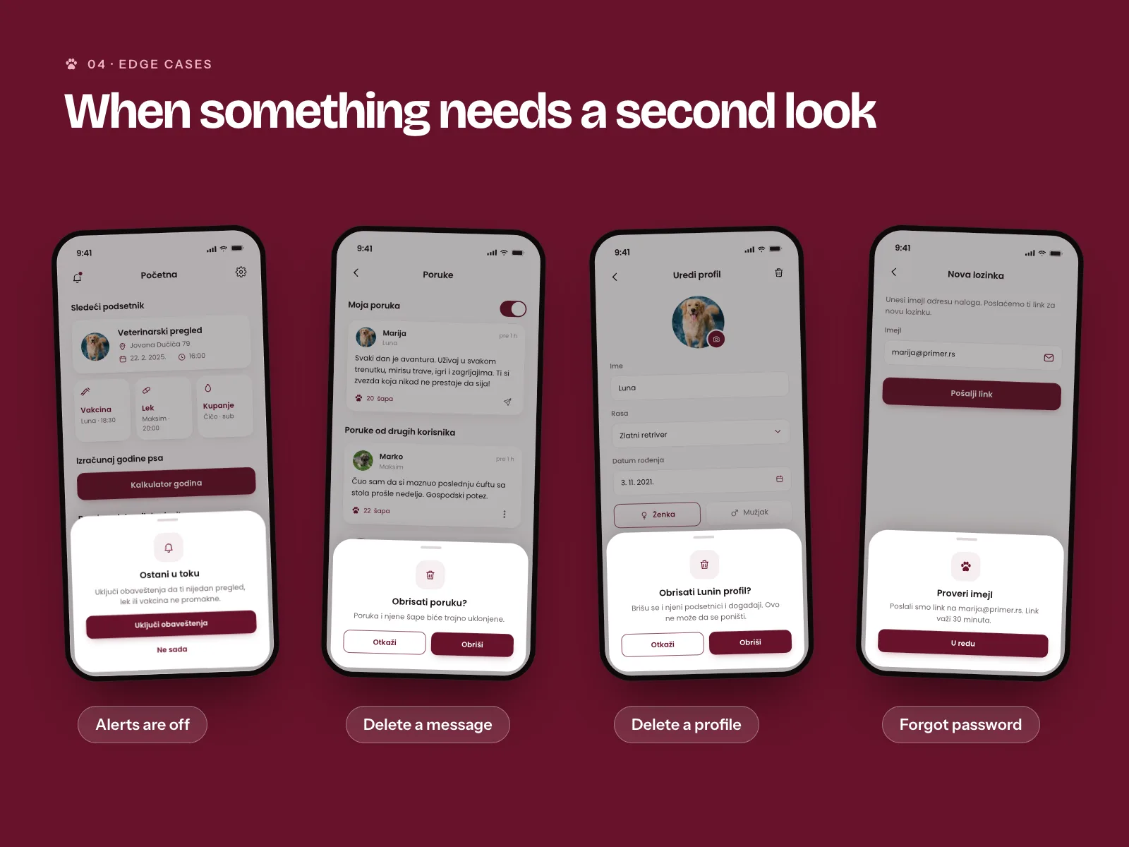
I designed the moments when something could go wrong as carefully as the main screens. If alerts are off, a sheet explains that you might miss a vet visit and offers Uključi obaveštenja or Ne sada. Deleting Luna's profile says by name that her reminders and events go too and that it can't be undone. Forgot password tells you where the link went and that it works for 30 minutes. Every one of these says what will happen before you tap, which matters most in an app that holds your dog's health history.
- 07
Invitations instead of sign-ups
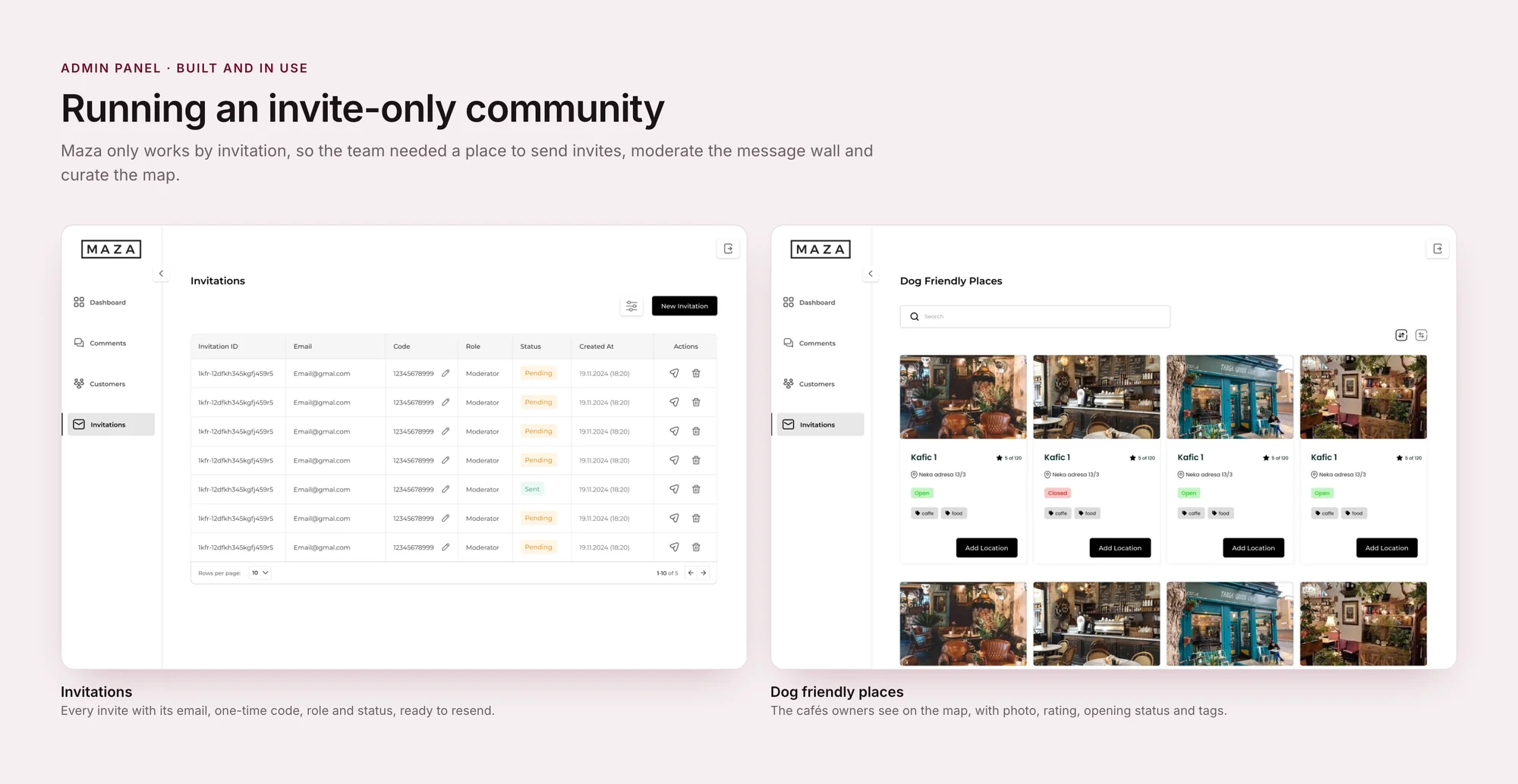
Maza works by invitation only, so there is no sign-up screen in the app. The team runs the community from an admin panel I designed alongside it. Invitations lists every invite with its email, a one-time code you can edit, the role, like Moderator, and whether it is Pending or Sent. A paper plane resends it and a bin cancels it, right on the row. A closed app grows slower than an open one. In return, the message wall stays small and friendly. The admin panel's job was to make that choice easy to manage.
- 08
A map someone looks after
Owners can suggest places in the app, but what ends up on the map is decided in the panel. Dog Friendly Places shows every café with its photo, address, rating out of all reviews, Open or Closed, and tags like caffe and food, as a grid of photos or a list for faster scanning. Add Location sits on each card. Curating by hand takes the team's time, but a map that sends someone with a dog to a café that turns them away loses trust fast. Comments and Customers work the same way: plain lists, one action per row.
- 09
Black and white for the team, burgundy for the owners
The panel uses the same logo and type as the app, but almost no colour. It is a working tool for a small team, used at a desk, so I let the content carry the screen: photos of the places, statuses in small green, amber and red labels, and one black button per page. The burgundy stays in the app and on the website, for the people Maza is really for.
- 10
A website that points to the app
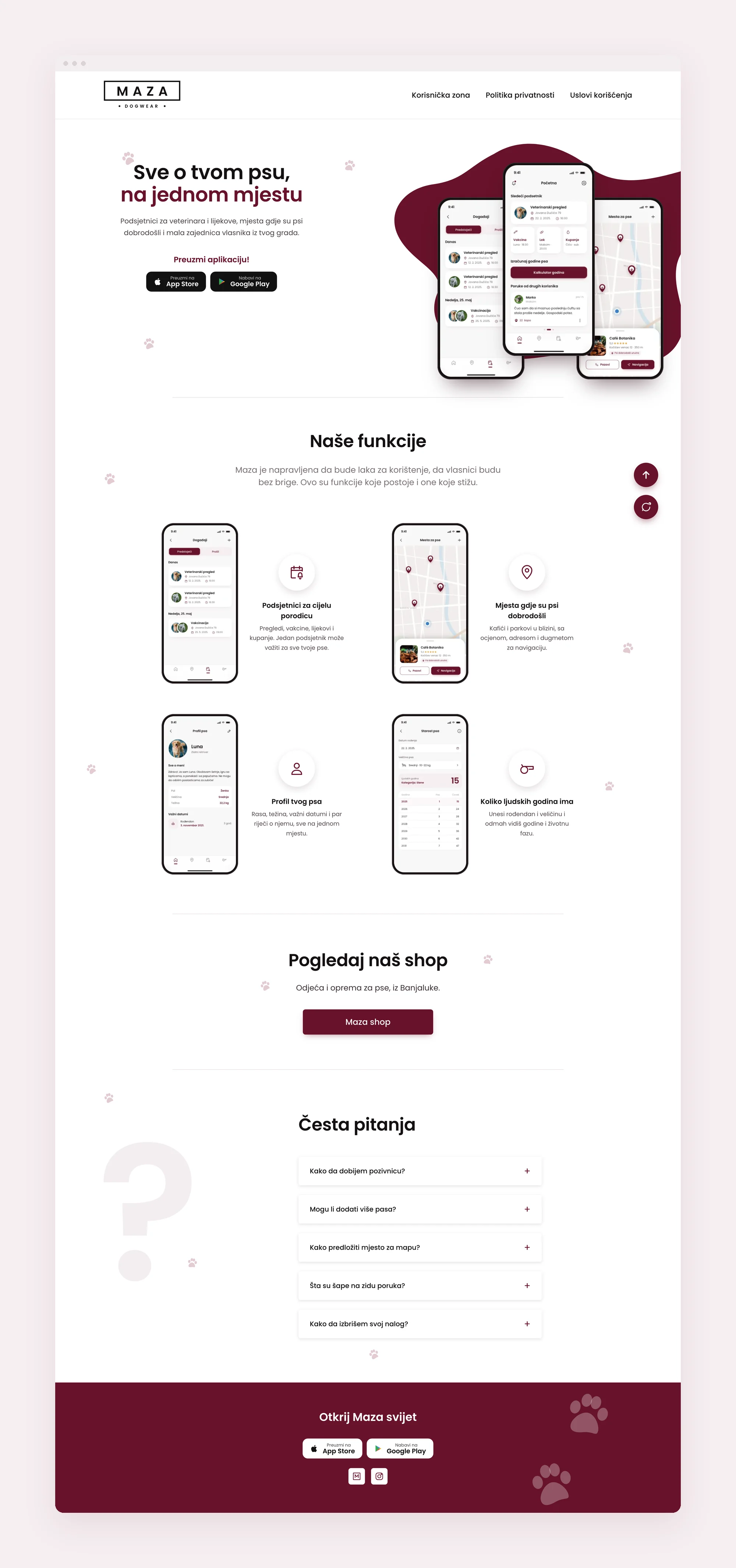
The website has one job: get owners into the app and the shop. The hero shows three phones on a burgundy shape with Download Now! and the App Store and Google Play badges. Our Features follows with four rows, each a real app screen next to an icon for events, the map, the dog profile and the clicker. Then Check out our shop with one button to the Maza shop, a short FAQ in an accordion, and a burgundy footer, Discover Maza world, with the store badges again. Korisnička zona, privacy and terms sit in the top bar. A one page site can't say everything, so I kept only what helps someone decide to download, and the badges appear twice, at the top and at the end, where people usually decide.
04
Design system
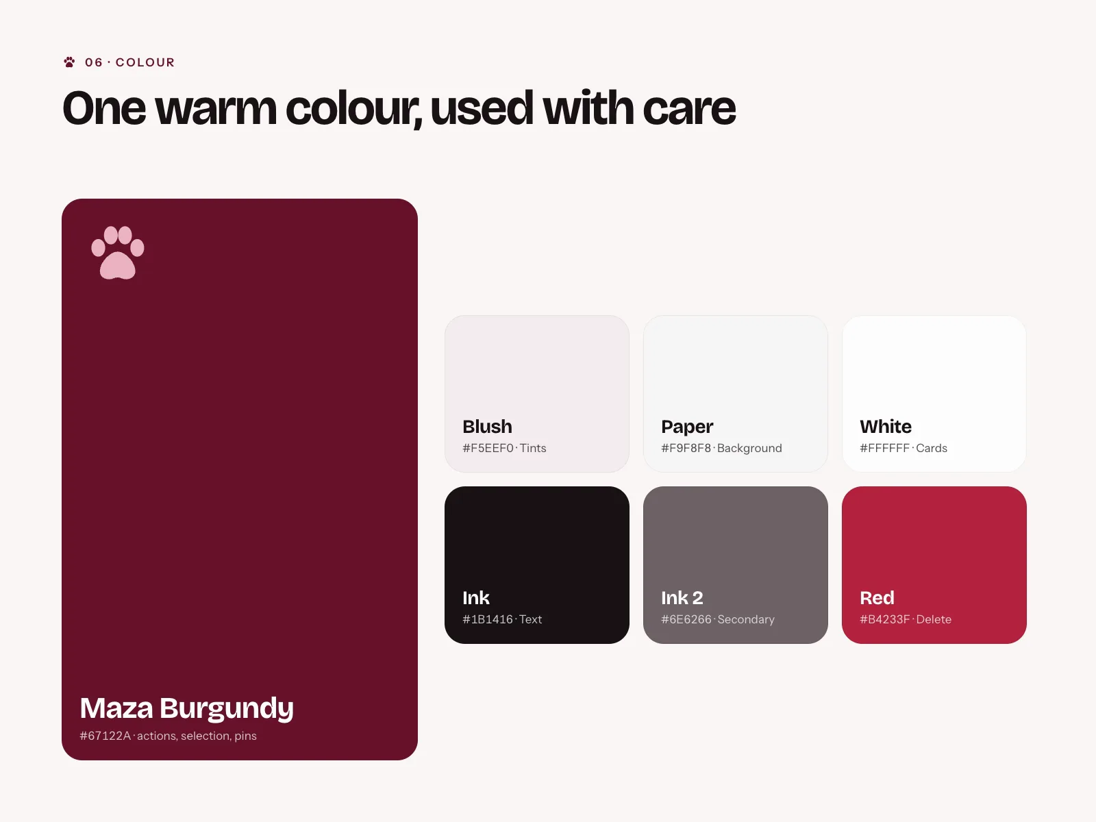
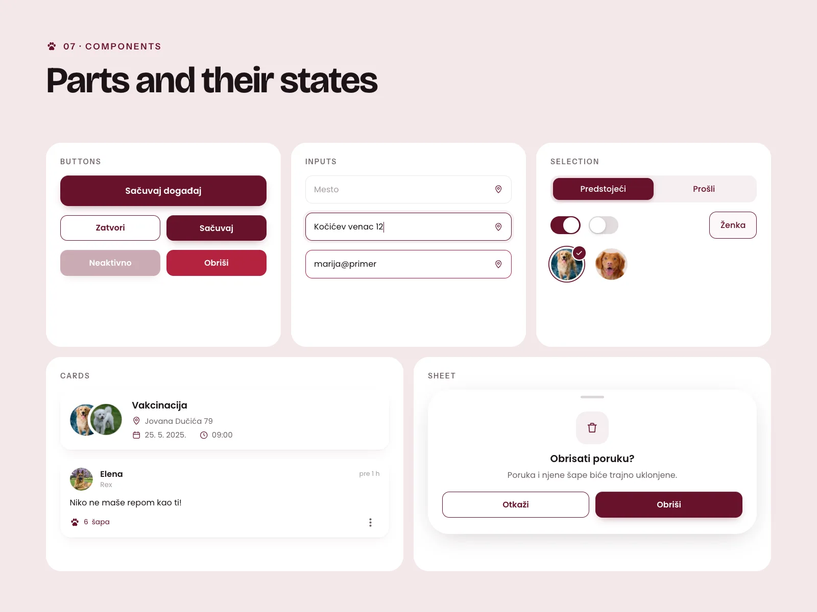
One warm colour, Maza Burgundy, for every button, selection and map pin. The rest is soft paper and blush tones, so the dogs' photos are the brightest thing on every screen. Because the owner cared so much about how the app looks, I gave the type room to breathe and kept the screens calm, and I checked every text colour for good contrast.
05
Final screens
06
Outcome
I designed Maza for iOS and Android, from the first user flows to a full design system ready for the developer. Around it I designed the website, which sends owners to the App Store, Google Play and the Maza shop and answers the usual questions, and the admin panel the team runs the community from. The app is live as a closed app that works by invitation.
Next project