Burger ordering website · Personal project
Forge
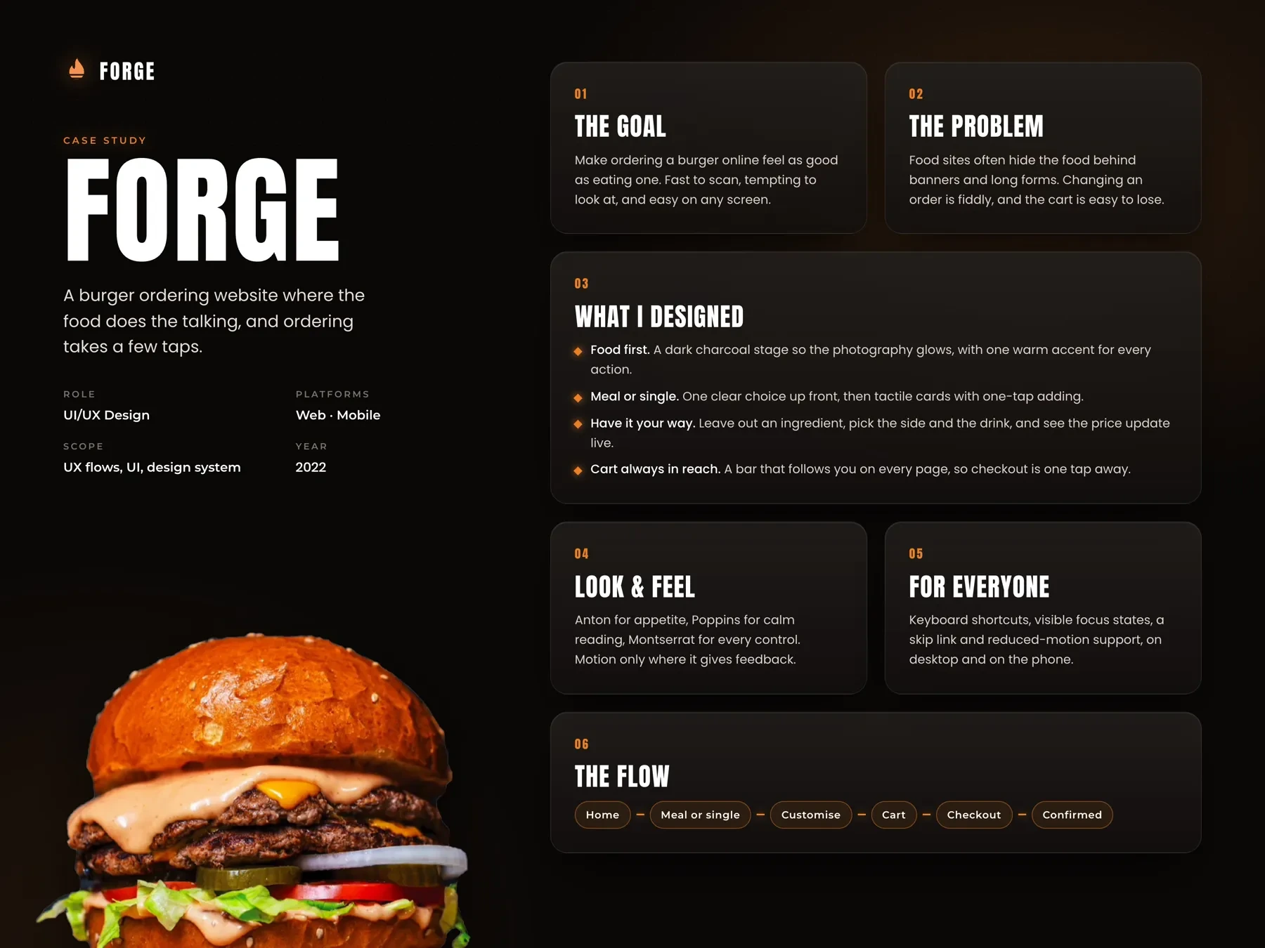
Forge is a burger ordering website for phone and desktop. I wanted the burger to be the biggest thing on every screen and the order to take only a few taps, from the first scroll to the confirmation.
- Role
- UI/UX design, interaction design
- Platform
- Responsive web
- Scope
- Ordering flow, design system
- Year
- 2022
01
The challenge
Before I started, I looked at a lot of burger and fast food websites. The burger was usually somewhere under a promo banner, and changing it meant a form full of checkboxes. Meal or single was often hidden in a dropdown, and the real total only showed up at checkout, once delivery was added. When you're hungry, every extra screen is one more reason to give up.
The burger is somewhere else
Promo banners take the top of the page, and the food starts halfway down.
Changes feel like a form
Leaving out the onion or adding cheese means checkboxes and dropdowns, often on another page.
The total moves at checkout
Extras and delivery show up late, so the price you saw isn't the price you pay.
Made for a mouse
Small buttons and a cart icon in the corner are hard to reach with one thumb.
02
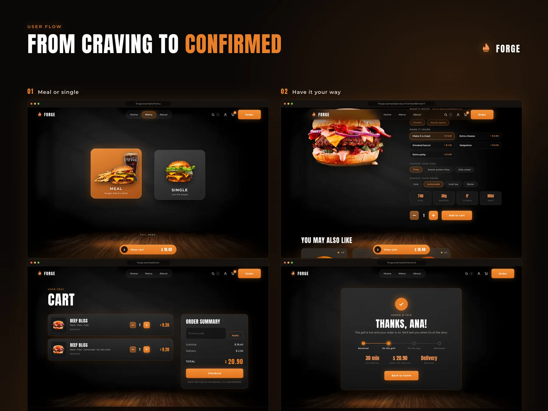
User flow
- 01Browse
- →
- 02Choose burger
- →
- 03Meal or single
- →
- 04Customise
- →
- 05Cart
- →
- 06Checkout
- →
- 07Confirmed
03
Key decisions
- 01
One orange for every action
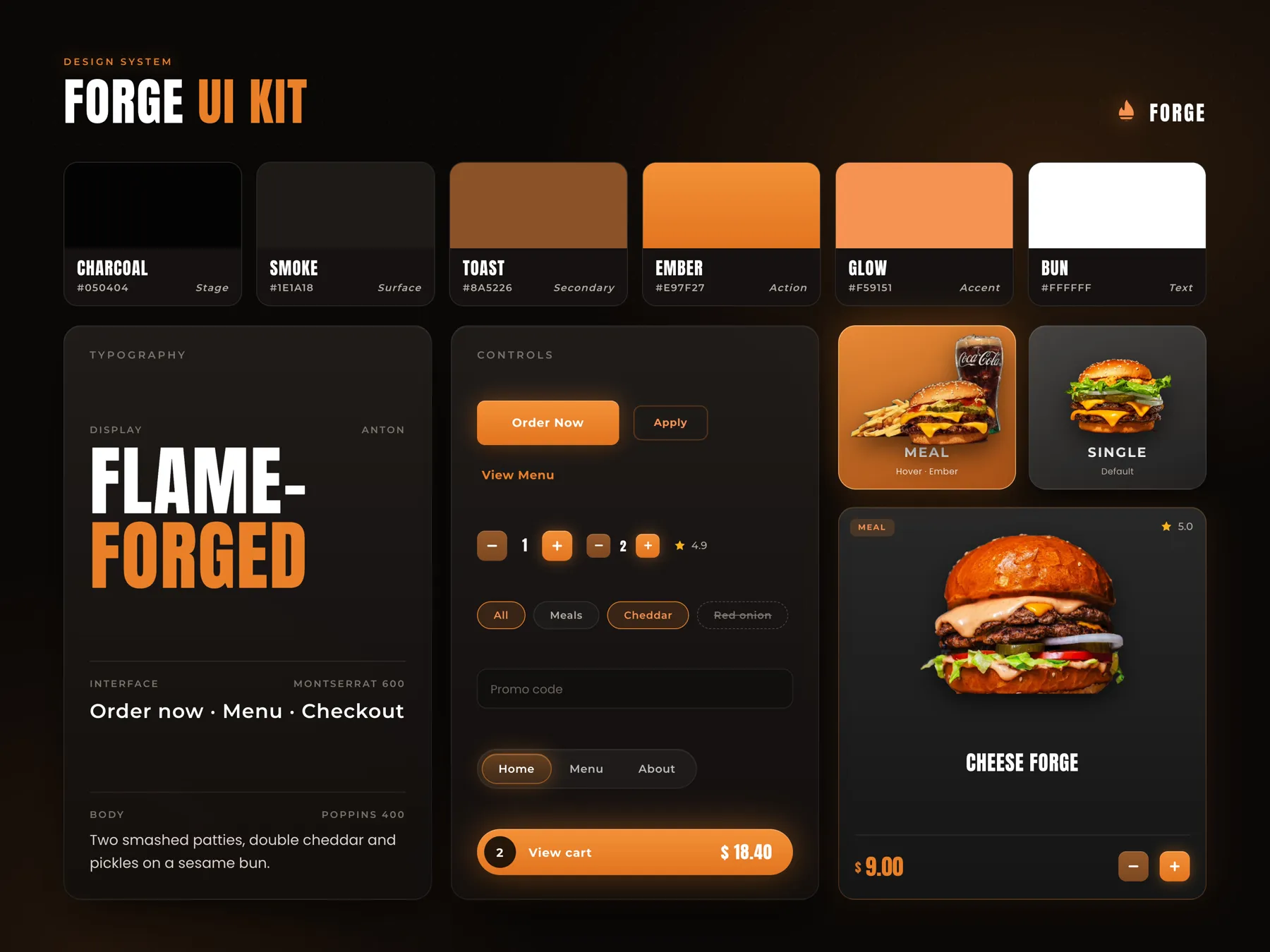
The whole site sits on Charcoal, almost black, so the burger photos glow. Then I gave one colour, Ember orange, to everything that moves your order forward: Order Now, plus, Add to cart and View cart. The cost is that orange can't be used for decoration anywhere. Even the minus button had to step back into a quieter Toast brown, so the step that adds something always looks like the main one.
- 02
Order from the first screen
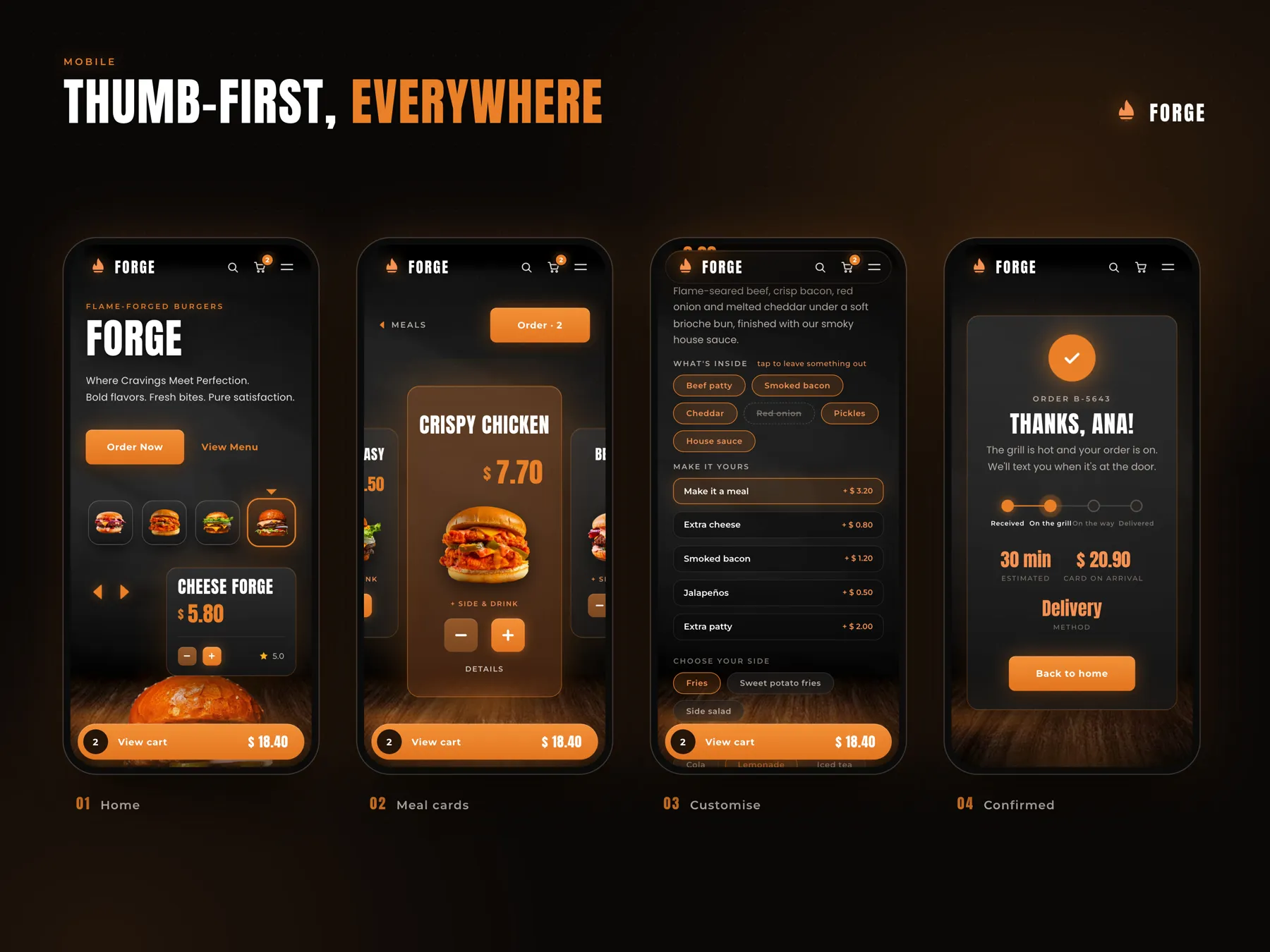
On the home screen the big burger has a small card next to it: Cheese Forge, $5.80, minus, plus and a 5.0 rating. Under Order Now there's a row of four burger thumbnails and arrows to switch which one is in the card. So you can put a burger in the cart before you've scrolled at all. The card had to stay small so it doesn't cover the photo, which means it only shows the name, price and rating. Everything else waits on the burger page.
- 03
Meal or single first
Before the menu shows a single burger, it asks one question with two big cards: Meal, burger, fries and a drink, or Single, just the burger. It's the choice that changes the price most, so I put it first and made it a picture instead of a dropdown. It does add a screen to the flow, so I kept that screen almost empty. If you pick Single and change your mind, Make it a meal is still there on the burger page for +$3.20.
- 04
Leave things out with a tap
On the burger page every ingredient is a pill under What's inside, with a small hint: tap to leave something out. Tap Red onion and it gets crossed out with a dashed border, so you still see what you removed. Extras like Extra cheese or Smoked bacon are rows with the price on the right, and side and drink are pills again. It makes a long page on a phone, but every change is in one place, and in the cart the line still says No red onion, so you can check it before you pay.
- 05
A cart that stays where your thumb is
The View cart bar sits at the bottom of every screen, with the number of items on the left and the total on the right. That's where a thumb already rests, so checkout is always one tap away. In the cart, Order summary puts subtotal, delivery and total together, and a note says how much more you need for free delivery. The same $20.90 shows again on the confirmation screen. The bar covers a strip at the bottom of the page, and I accepted that, because losing the cart would cost more than a bit of photo.
- 06
Motion only when something happens
Cards glow on hover, buttons press in, and the cart bar bumps when something lands in it. Each of these tells you your tap worked, so I kept them and dropped everything that moved just for show. With reduced motion turned on they stop, and the numbers still change. On a dark site with orange buttons it's easy to lose track of focus, so I added visible focus states, a skip link and keyboard shortcuts like / for search.
04
Design system
I wanted Forge to feel like standing next to a hot grill late at night. The page is Charcoal and Smoke, a wooden floor glows at the bottom of each screen, and the burgers are cut out so they sit on it like on a counter. Anton is for burger names and prices, because it's tall and tight and reads like a menu board from across the room. Montserrat 600 is for buttons and labels, and Poppins 400 for descriptions, so longer text stays calm next to the loud titles. Corners are soft and buttons have a little depth, so they look like something you can press.
05
Final screens
06
Next steps
Next, I'd test the Meal or single screen. Does it help, or would people rather go straight to the menu and pick a meal on the burger page? I'd watch a few people build a burger on their phone and see if they notice the crossed out ingredients. I'd also add a way to order last time's burger again in one tap.
Next project