Steakhouse website
Ember & Oak
Ember & Oak is a steakhouse website for Kitzbühel, in German and English. I wanted it to feel like walking into the dining room in the evening: dark, warm and in no hurry.
- Role
- UI/UX design
- Platform
- Responsive web
- Scope
- Website, booking, design system
- Year
- 2026
01
The challenge
When I looked at steakhouse websites, most had the same three things: a photo of a steak, a PDF menu and a phone number. They told you the restaurant exists, and very little about what an evening there is like. The menus list cuts and grams, and nobody explains what you're choosing between or what medium rare will look like on the plate. Booking often meant calling during opening hours. And a restaurant in Kitzbühel needs all of it in German and English.
A menu without an evening
A PDF and a phone number don't show the fire, the room or the pace of a dinner.
Medium rare is just a word
Guests order a doneness by name and only see what it means when the plate arrives.
Booking by phone or dropdown
Small selects for date, time and party size are slow on a phone, and a call only works if someone picks up.
German runs longer
German labels are often longer than English ones, so a layout made for one language breaks in the other.
02
User flow
- 01Grill film hero
- →
- 02Cuts
- →
- 03Doneness guide
- →
- 04Menu
- →
- 05Reserve: date
- →
- 06Guests & time
- →
- 07Summary
- →
- 08Request sent
03
Key decisions
- 01
Open with the grill
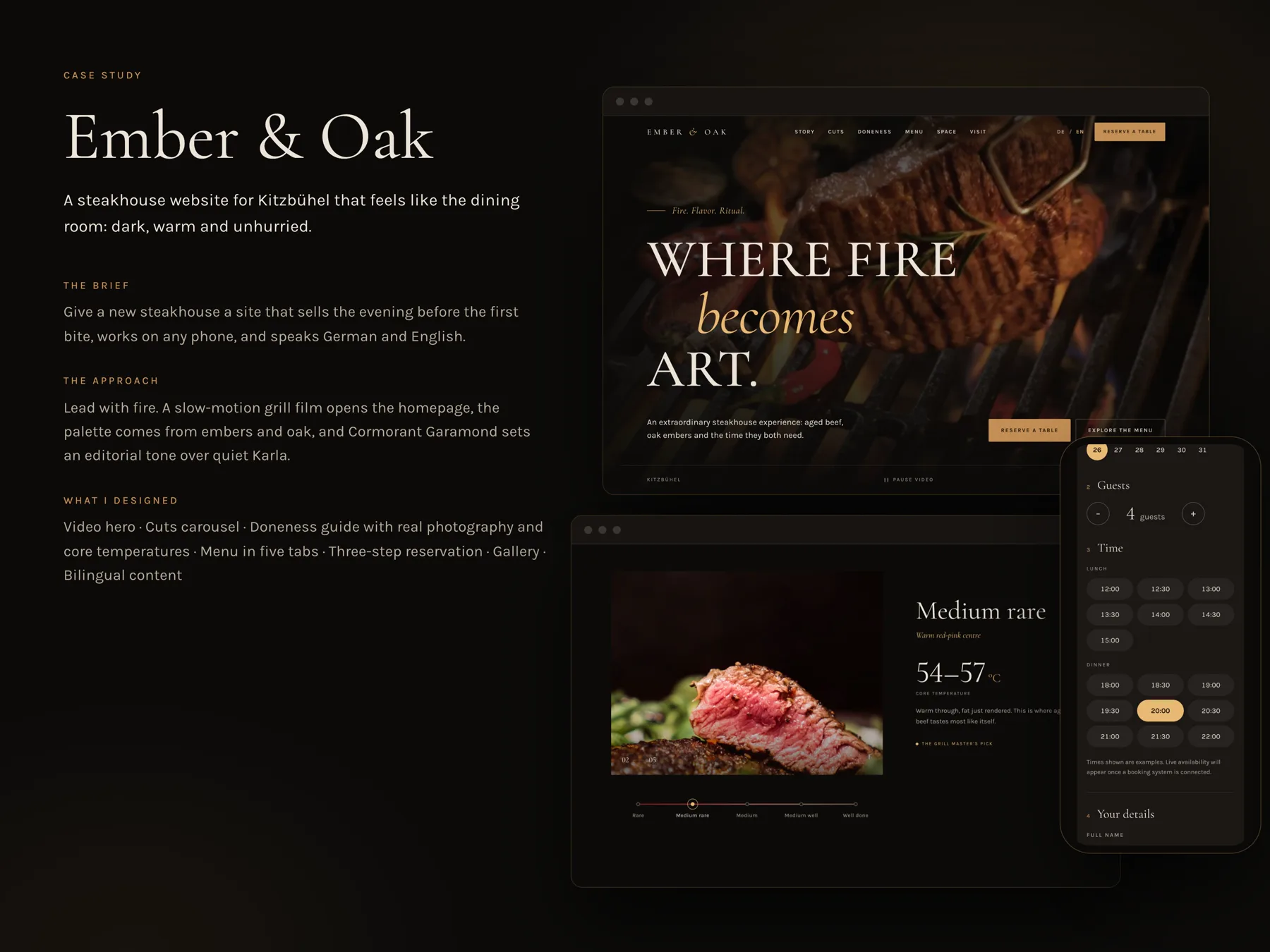
The homepage starts with a slow film of steak on the grill, with Where fire becomes art. over it, and becomes set in italic amber. A photo would load faster, but it can't show fire moving, and the fire is what makes you want to book. Video can also be distracting, so there's a Pause video button right on the hero, and with reduced motion turned on the film stays still. Everything else on the site moves slowly too, like a dinner you don't want to rush.
- 02
Cuts with a story
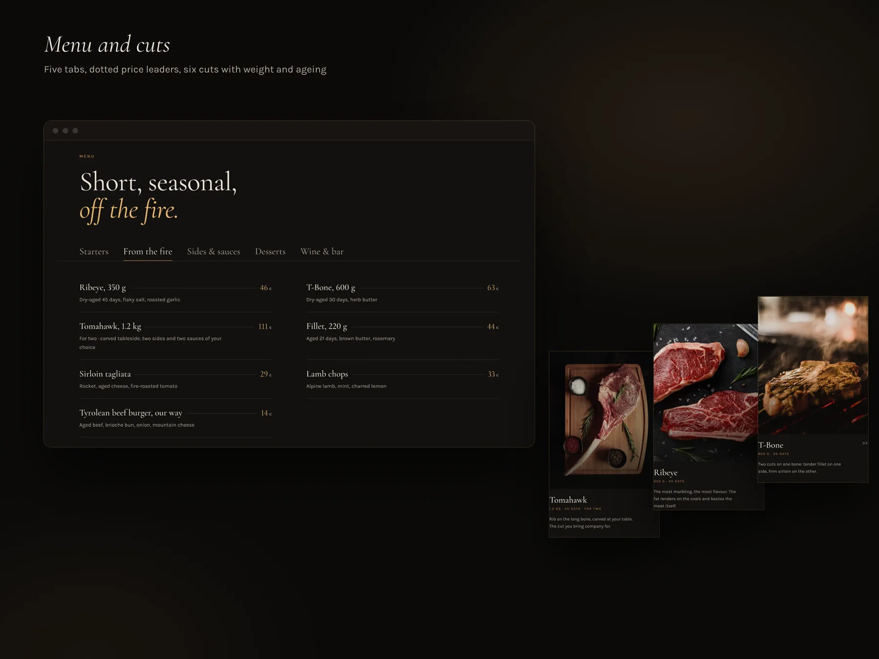
The six cuts get their own carousel, each with a tall photo, a small line with weight and ageing, like 350 g · 45 days, and two sentences about the cut. The T-Bone is two cuts on one bone, and the Tomahawk is carved at your table, for two. I wanted people to know what they'd pick before they see a price. A carousel hides most cuts until you swipe, so the menu below lists them all again with prices, for people who just want to compare.
- 03
Show doneness instead of naming it
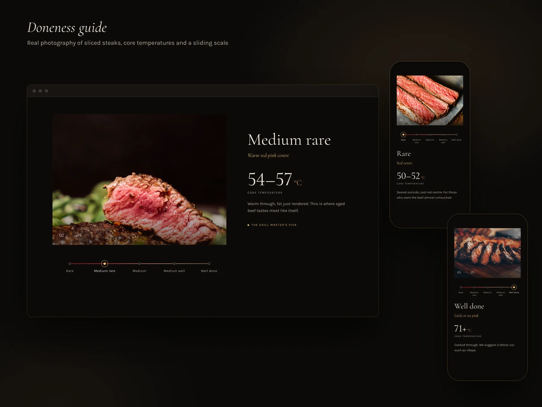
The doneness guide has five steps on a slider, from Rare to Well done. Each step has a real photo of a sliced steak, a short line like Warm red-pink centre, and the core temperature, 54 to 57 °C for medium rare. I used temperatures because they're exact and the same in both languages. On Well done the text simply suggests a fattier cut such as ribeye, without any judgement. The cost is that the guide lives on photos, so if the kitchen changes how it cooks or plates, the pictures have to change too.
- 04
A menu you can read like paper
The menu has five tabs: Starters, From the fire, Sides & sauces, Desserts and Wine & bar. Each dish has its name and weight, a dotted line and the price at the end, like a printed menu. Under it one short line says how it's aged and what comes with it, for example Dry-aged 45 days, flaky salt, roasted garlic. Tabs hide four sections at a time, which is a cost if you like to read the whole menu, but they keep it short on a phone.
- 05
One page to ask for a table
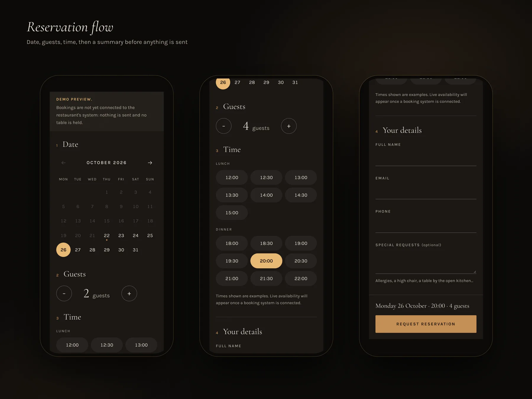
Booking is one page with four numbered steps: Date, Guests, Time and Your details. The date is a calendar, guests is a counter with minus and plus, and times are buttons split into Lunch and Dinner, so nothing hides in a dropdown. Before you send, one line repeats your choice in plain words, Monday 26 October · 20:00 · 4 guests, right above Request reservation. Special requests has examples under it, like a high chair or a table by the open kitchen, so people know what they can ask for. The site isn't connected to a booking system yet, and the page says so openly, with a Demo preview note and a line saying the times are examples.
- 06
Two languages, one layout
DE and EN sit in the top bar on every page, and every text switches without reloading. I planned every button and label for the longer German version first, so nothing wraps or gets cut off. The uppercase labels with wide spacing, like Reserve a table, needed the most room. The cost is a bit more empty space in English, which on a dark, slow page I don't mind.
04
Design system
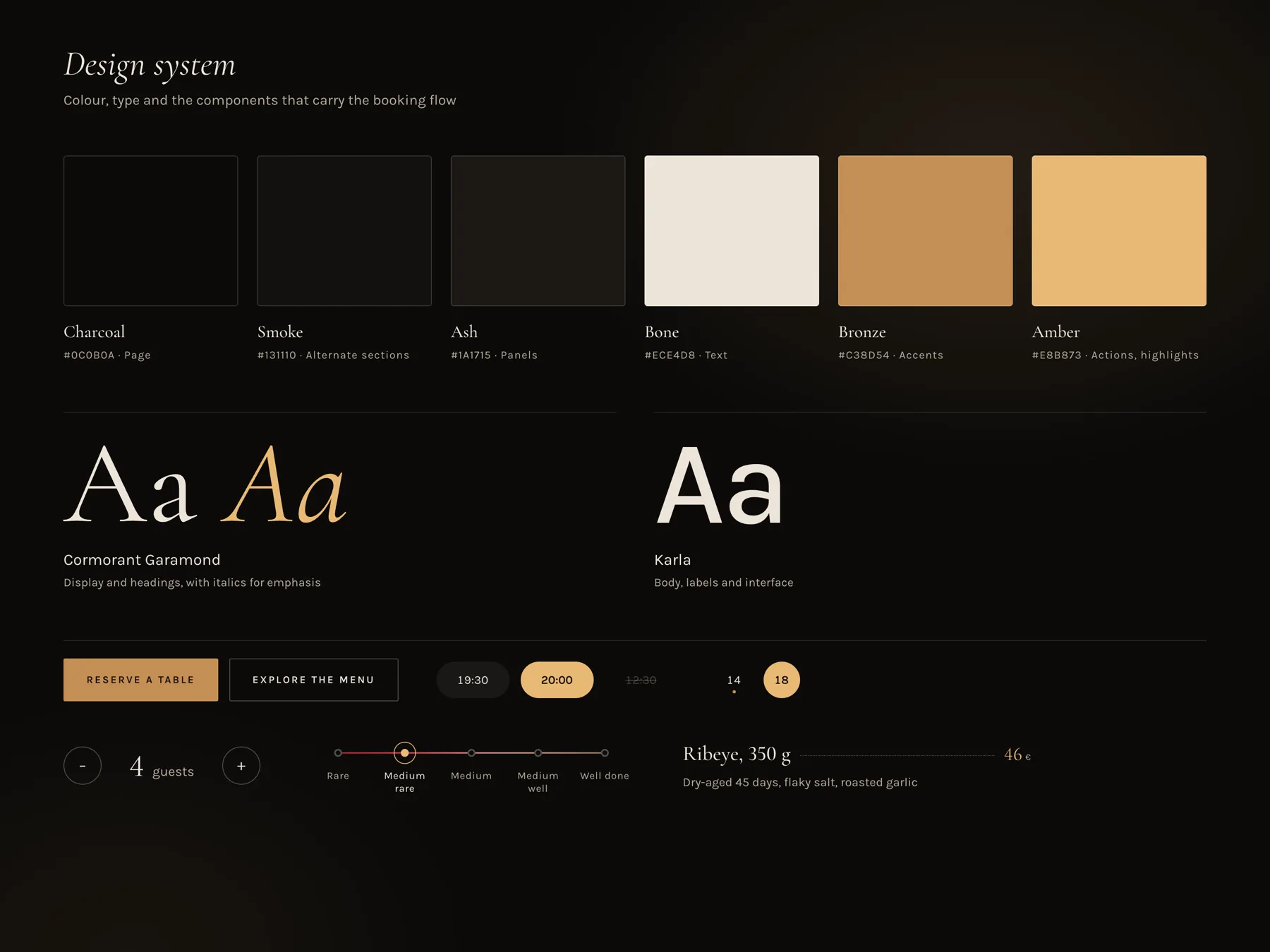
I took the colours from the grill: Charcoal for the page, Smoke for alternate sections, Ash for panels, Bone for text, Bronze for accents and Amber for actions and highlights. I used Bone instead of pure white, because white on near black felt harsh, and Bone is softer to read in a dark room. Cormorant Garamond is for headings, with italics in amber for the one word I want you to notice, like becomes or off the fire. Karla is for labels, buttons and body text, so the interface stays plain next to the serif. Buttons are square and only the things you pick are round, like times, dates and the guest counter, so a round shape always means a choice.
05
Final screens
06
Next steps
Next, I'd connect the booking page to a real reservation system and see what changes when some times are full. I'd show the doneness guide to a few people before they order and ask if the photos change what they pick. I'd also check the German version on the smallest phones, where the long labels have the least room.
Next project