Hiking & camping website · Client project
The Route
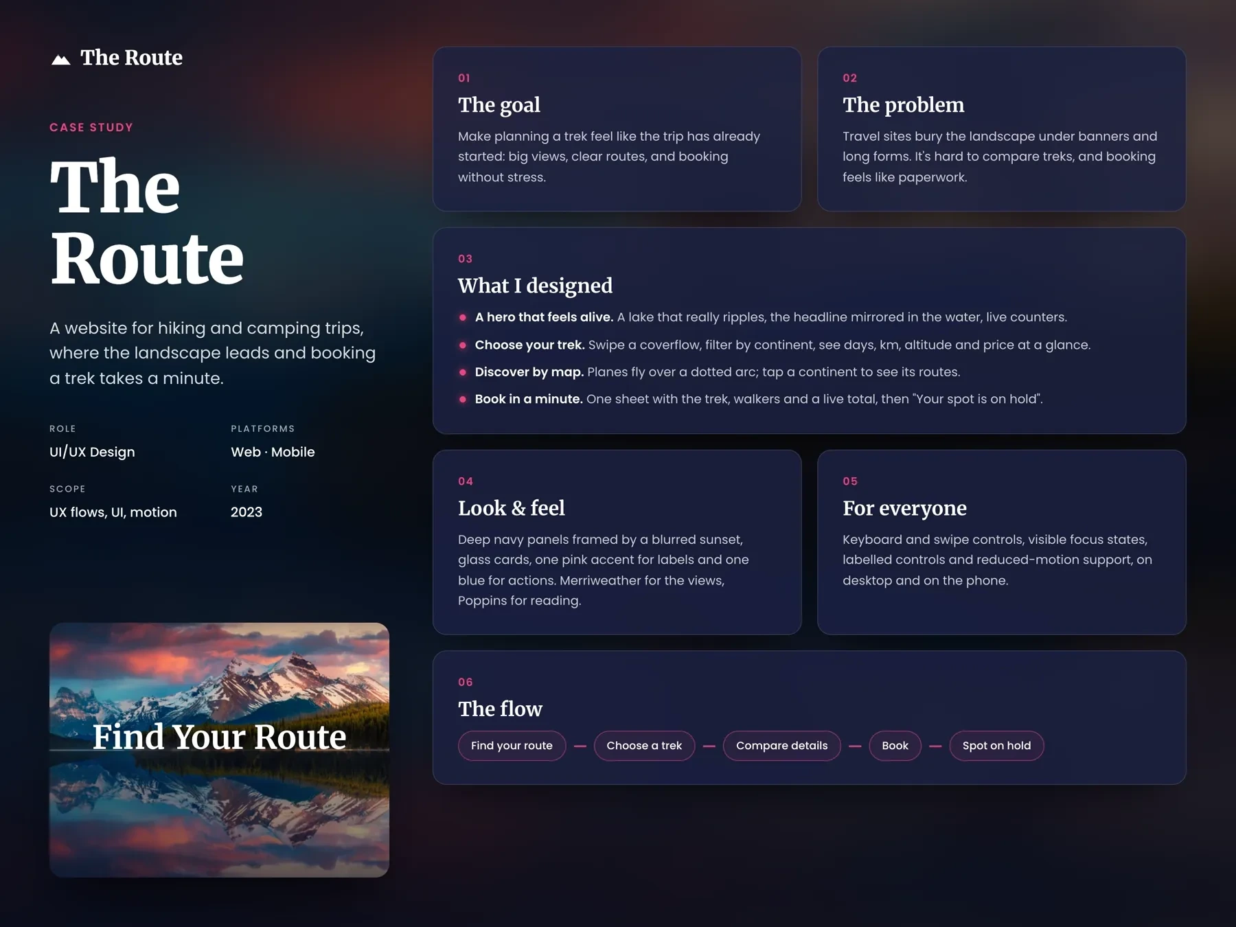
The Route is a website for hiking and camping trips. I wanted the landscape to come first and booking to take about a minute, so the first thing you see is a mountain lake at sunset with “Find Your Route” mirrored in the water.
- Role
- UI/UX design, motion
- Platform
- Responsive web
- Scope
- Website, booking, design system
- Year
- 2023
01
The challenge
When I looked at travel and trekking websites, the photos were usually the best part, and they were often covered by banners and offers. To compare two treks I had to open both and look for the days, the distance and the price, which sat in different places on each page. Booking usually meant a long form before you saw any total. And treks were listed by name, so unless you already knew Vinicunca or Kirkjufell, you had no idea where in the world they were.
The view is covered
Banners and offers sit on top of the one thing that makes people want to go.
Numbers in different places
Days, distance, altitude and price are spread over separate pages, so comparing two treks takes a lot of clicking.
Booking feels like paperwork
Long forms come before the price, and you don't know what happens after you send them.
Names without places
A list of trek names doesn't tell you which part of the world you're looking at.
02
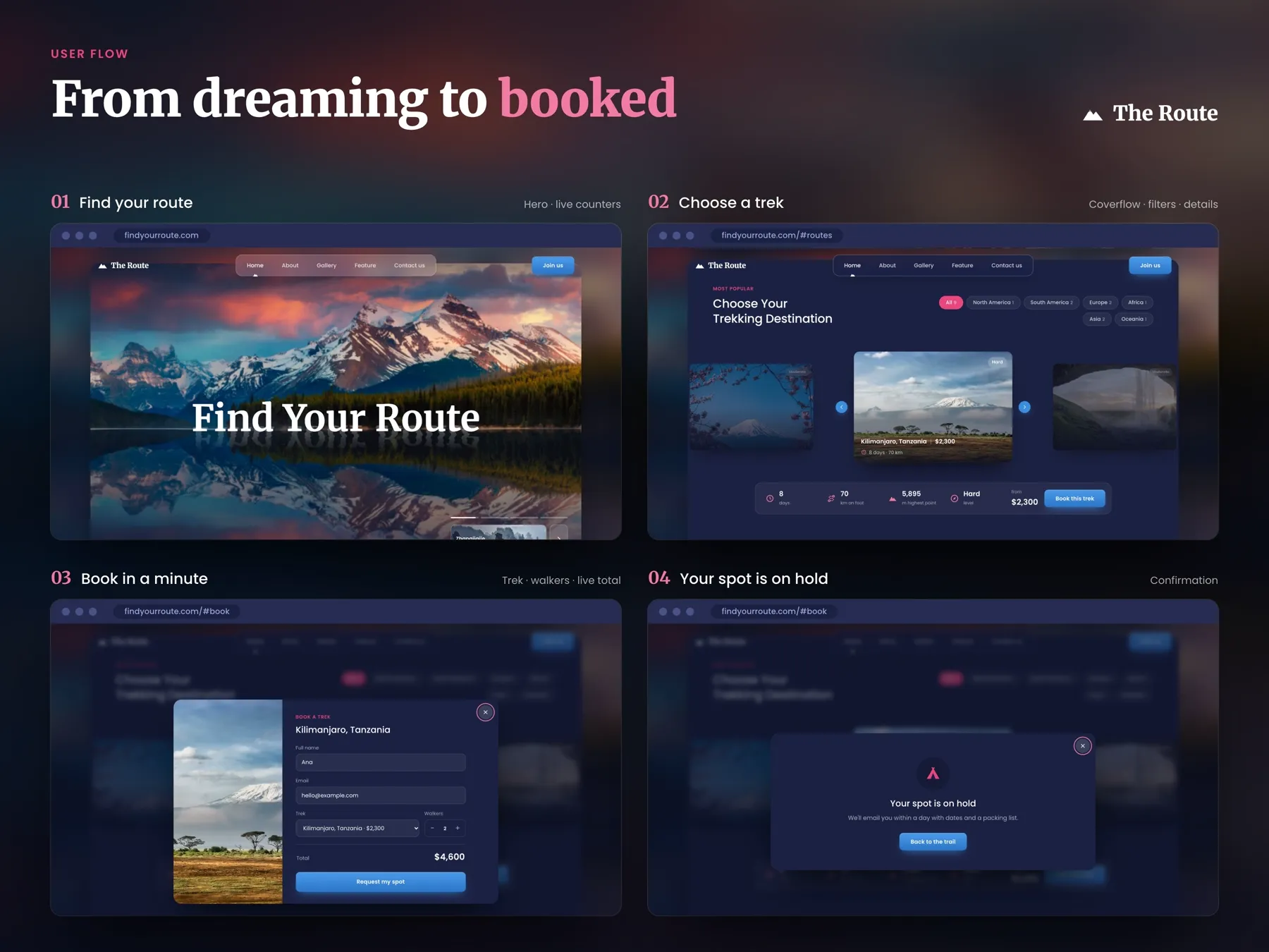
User flow
- 01Hero
- →
- 02Choose a trek
- →
- 03Filter & compare
- →
- 04Explore the map
- →
- 05Trek details
- →
- 06Booking sheet
- →
- 07Confirmed
03
Key decisions
- 01
The title sits on the water
I put “Find Your Route” on the shoreline of the lake, so the water reflects it the same way it reflects the mountains. In the browser the lake and the reflection ripple gently. White text over a busy photo can be hard to read, so I placed it on the calm strip where the trees meet the water and set it in Merriweather Bold. The glass counters and the small trek slider stay low in the corners, away from the peaks.
- 02
One trek in front, its numbers underneath
Treks sit in a coverflow with one card in front and the others blurred at the sides. Under the card is a bar with the same five things for every trek: days, km on foot, highest point, level and the price. For Kilimanjaro it reads 8 days, 70 km, 5,895 m, Hard and $2,300. The cost of a coverflow is that you only see one trek properly at a time. I accepted that because there are nine treks, and the bar stays in place while only the numbers change, so you can compare without your eyes moving around the page.
- 03
Continents you can count
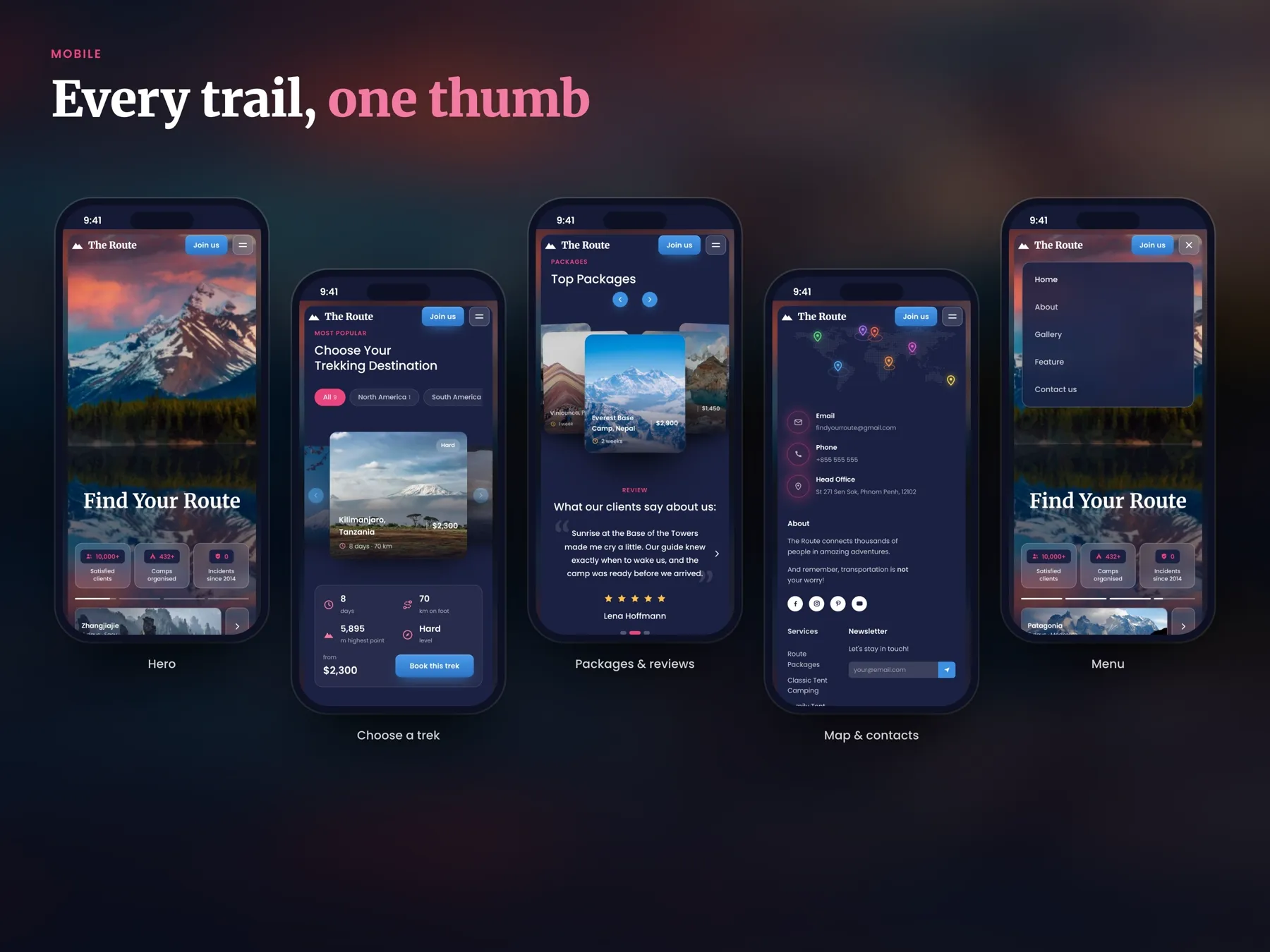
The filter chips above the coverflow show how many treks each continent has: All 9, Europe 2, Africa 1 and so on. With so few treks, I didn't want anyone to tap a continent and find one lonely card by surprise, so the number answers that before the tap. On the phone the chips scroll sideways in one row instead of wrapping onto three lines.
- 04
A map as a second way in
Below the treks there's a world map with planes flying along a dotted arc. Tap a continent and its routes show up. If you already know where you want to go, a map is slower than a chip, so I kept it below the coverflow as the place to browse. It's for people who start from “somewhere in South America” before they know any trek names.
- 05
Booking in one sheet
Book this trek opens a sheet over the page, with the trek photo on the left. You type your name and email, check the trek, and set the number of walkers with plus and minus. The total updates as you go, so two walkers on Kilimanjaro shows $4,600 before you send anything. There are no dates or payment in the sheet. That keeps it short, but it also means you're not finishing a purchase here, so the button says Request my spot and the next screen tells you what happens: your spot is on hold, and an email with dates and a packing list comes within a day.
- 06
Top packages, then what people said
The best trips sit together under Top Packages, a fan of cards such as Everest Base Camp, Nepal, 2 weeks, $2,900, with arrows to move through them. Right under them come reviews from people who went, one at a time, with a name and five stars, like Lena Hoffmann on sunrise at the Base of the Towers. I put the reviews next to the packages on purpose. When you are about to spend that much on a trip, what someone felt there helps more than one more photo. One review at a time keeps the section calm, but you have to tap to read the next one, so small dots show how many there are.
- 07
Motion with a job, and one thumb
Every animation shows something. The counters count up to 10,000+ clients and 432+ camps, the elevation profile draws itself as you scroll so you see how steep a route gets, and map pins drop in where the routes are. On the phone the trek numbers fold into a two by two grid, Book this trek sits right under the price, and the coverflow works with a swipe. Swipe and keyboard both work, focus states are visible, and the page respects reduced motion.
04
Design system
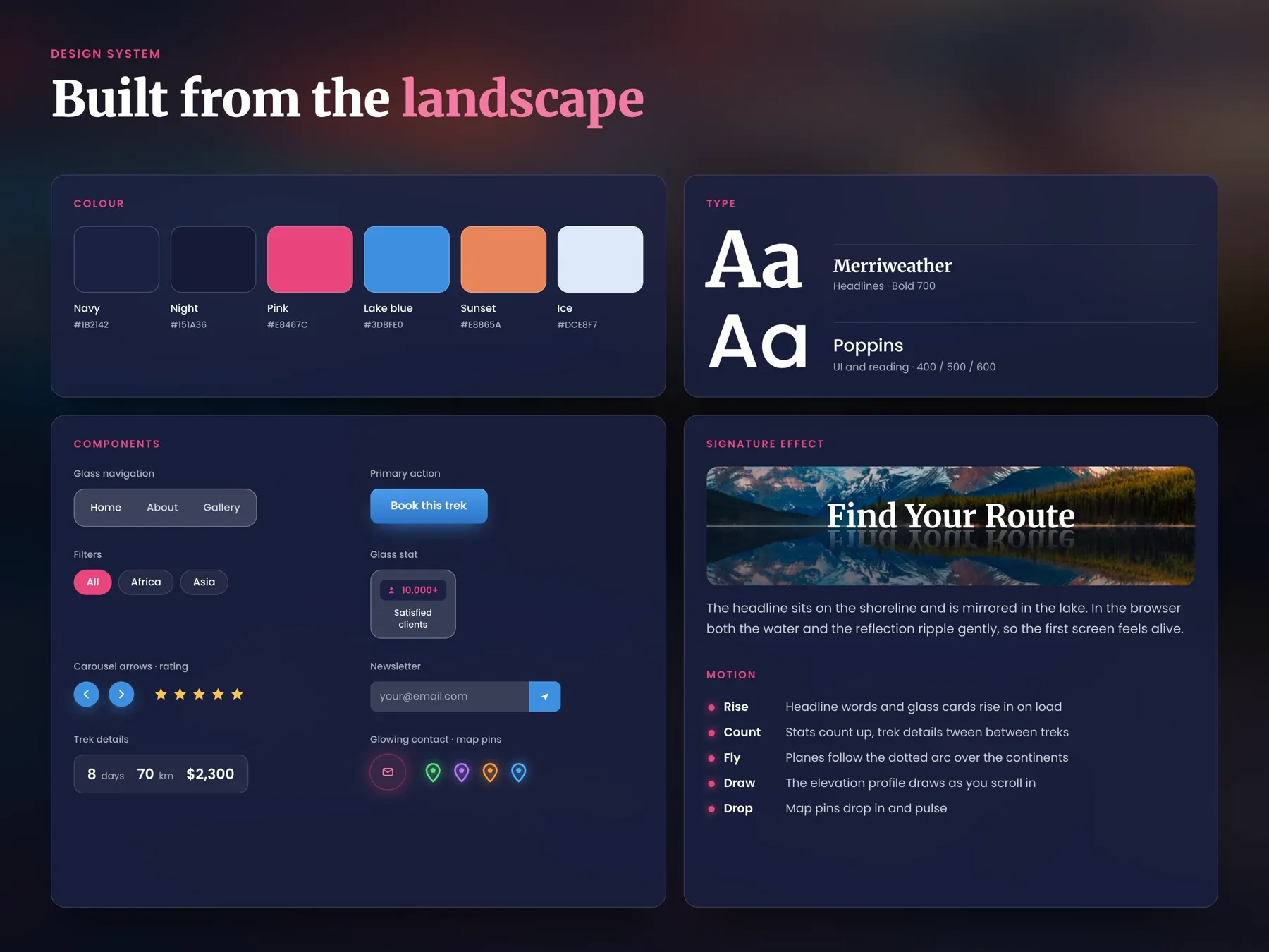
I took the colours from the hero photo. Navy and Night are the dark of the lake after sunset, and the panels sit on a blurred copy of that sunset, so the landscape is always somewhere behind you. Pink marks labels and where you are, like MOST POPULAR and the active filter. Lake blue is only for things you press, like Join us and Book this trek, so the next step is always the blue thing. Merriweather Bold carries the big titles because it holds up over a photo, and Poppins handles the numbers and small text, where it stays clear at small sizes.
05
Final screens
06
Next steps
Next, I'd like to see whether people use the map or the continent chips, and if nobody touches the map, I'd make it smaller. I'd add saved treks and a packing list for each route, since the confirmation already promises one. I'd also check the mirrored title on small phones, where the reflection gets very short.
Next project