Seat booking app · Personal project
Cinema
Cinema is an iOS app for booking a seat at the cinema. I wanted the seat map, the part most apps make hard, to be the clearest screen in the app, so you always know which seats are yours and what they cost.
- Role
- UX flow, UI design, prototype
- Platform
- iOS mobile app
- Scope
- 10 screens, design system
- Year
- 2023
01
The challenge
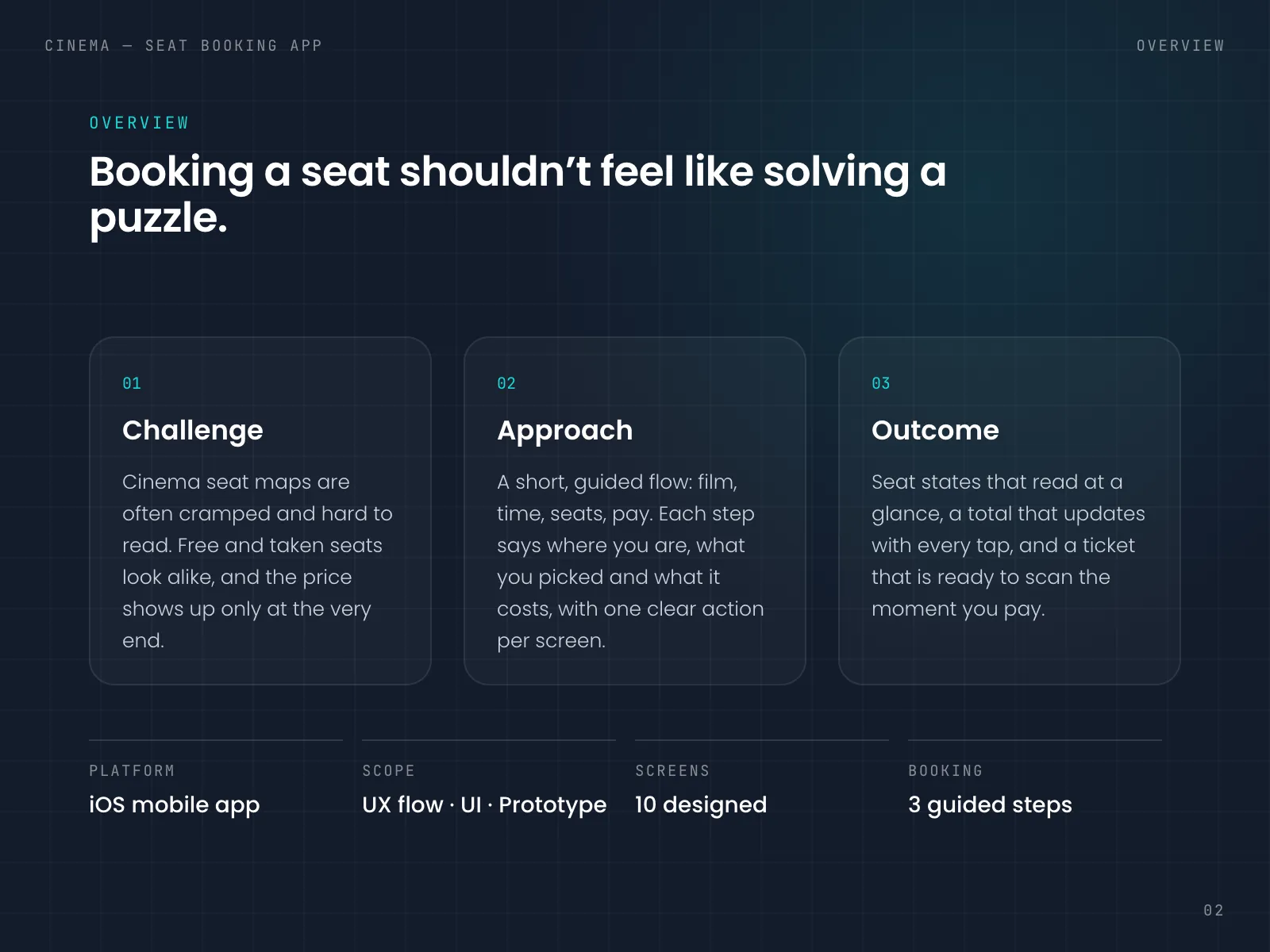
Booking a cinema seat on a phone sounds simple, but the seat map is usually where it slows down. The seats are tiny, and free and taken seats often differ only by a slightly darker grey. The price appears after you've chosen, and a booking fee sometimes shows up on top at payment. It's also hard to tell how many screens are still ahead. Each of these is small, but they all land on the one screen where you have to concentrate.
Seats too small to hit
Seats are packed so tightly that a thumb covers two or three of them.
Grey on grey
Free, taken and selected seats differ only by a shade, which is hard to see in a dark room.
The total comes late
You find out what two seats cost only after you've committed to them.
No sense of how far
Nothing tells you whether payment is the next screen or three screens away.
02
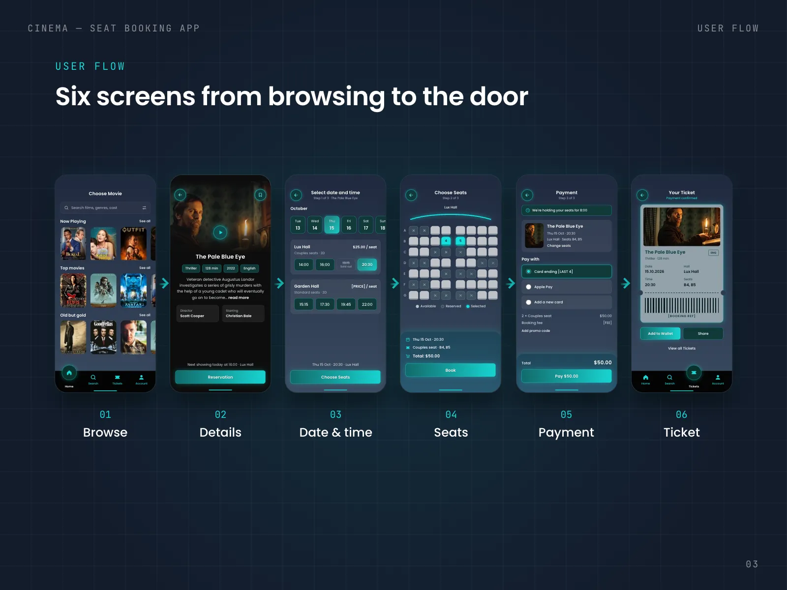
User flow
- 01Browse
- →
- 02Details
- →
- 03Date & time
- →
- 04Seats
- →
- 05Payment
- →
- 06Ticket
03
Key decisions
- 01
Count only the booking
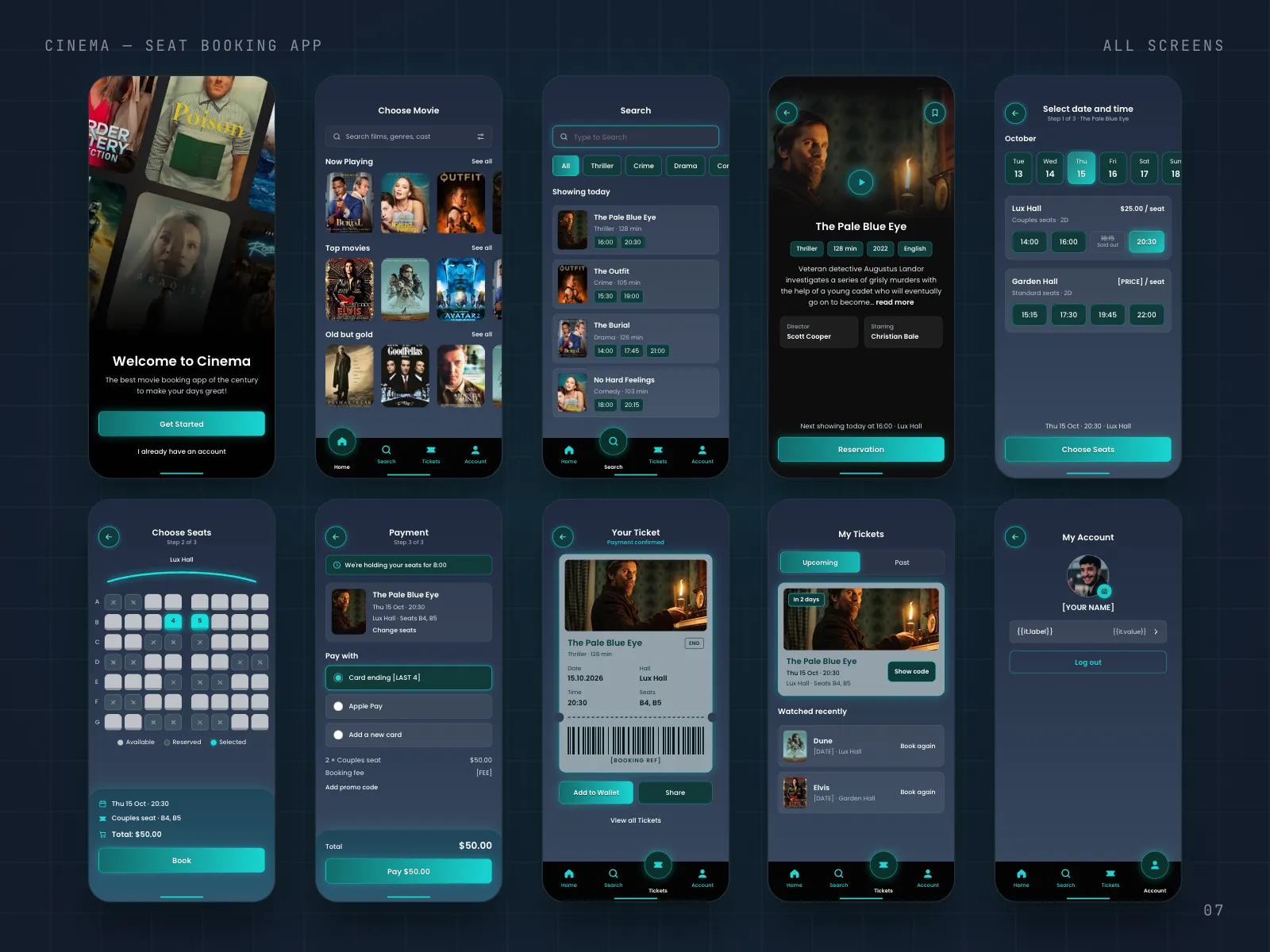
The app has six screens from browsing to the ticket, but only three of them are the booking: date and time, seats, payment. So the count starts after you tap Reservation on a film, and each title has Step 1 of 3, Step 2 of 3 or Step 3 of 3 under it. Browsing has no end, so I left it out. The cost is that the count seems to start late, but once it starts it never jumps.
- 02
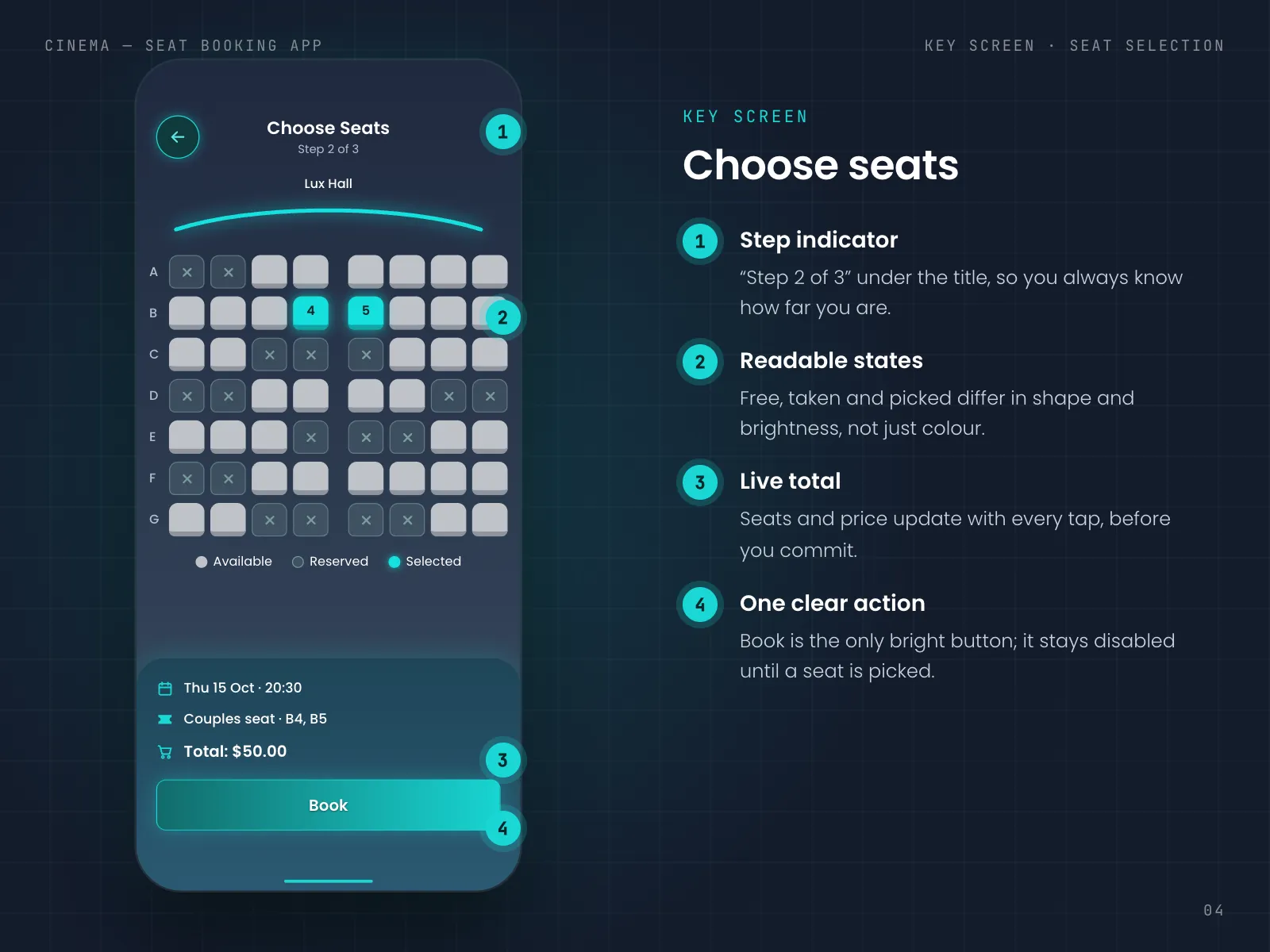
Seat states you can tell apart without colour
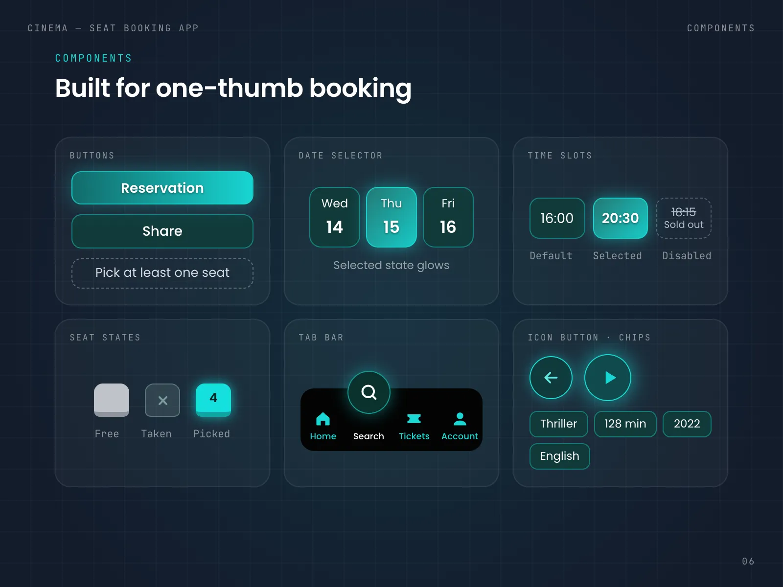
On the map a free seat is a light, raised tile, a taken seat is dark with an ×, and a picked seat turns teal and shows its number. So even if you can't tell teal from grey, the shape and the brightness still tell you. The ×s add a lot of marks to a full hall, so I kept them dim and let the free seats be the brightest thing on the screen. Because a picked seat shows its number, you don't have to count along row B to check it's B4.
- 03
A summary that stays under the map
Under the seats there is a panel with the date and time, the seat type and numbers, and the total: Thu 15 Oct · 20:30, Couples seat · B4, B5, Total: $50.00. It changes on every tap, so you see the price while you're still deciding. The panel takes the lower part of the screen, which leaves less room for the map. Lux Hall has seven rows of eight seats, so it fits, but a bigger hall would need zoom.
- 04
One bright button that says why it's off
Book is the only bright thing at the bottom of the screen. Before you pick a seat, the button is a dashed outline that says Pick at least one seat, so it tells you what to do next. Tapping a taken seat works the same way and tells you why you can't choose it. It's a few more words on screen, but nobody has to guess why nothing happens.
- 05
Halls and prices before the map
On the date and time screen each hall gets its own card with the seat type and the price per seat, like Lux Hall, Couples seats, $25.00 / seat. A sold out time stays in the row, crossed out with Sold out under it. I wanted people to know what a seat costs before they look for one, and to see that 18:15 exists but is full. It makes this screen busier, so the days run in one scrolling row at the top and the times are big enough to tap easily.
- 06
Calm at the end
Payment repeats the film, the time, the hall and the seats, with a Change seats link, so you can check everything once more without going back. A line at the top says We're holding your seats for 8:00. A timer can feel stressful, so I kept it as one plain line in the same teal as the rest of the app, with no red. After paying you get the ticket with a barcode, Add to Wallet and Share, and it waits in My Tickets with In 2 days on it and a Show code button.
04
Design system
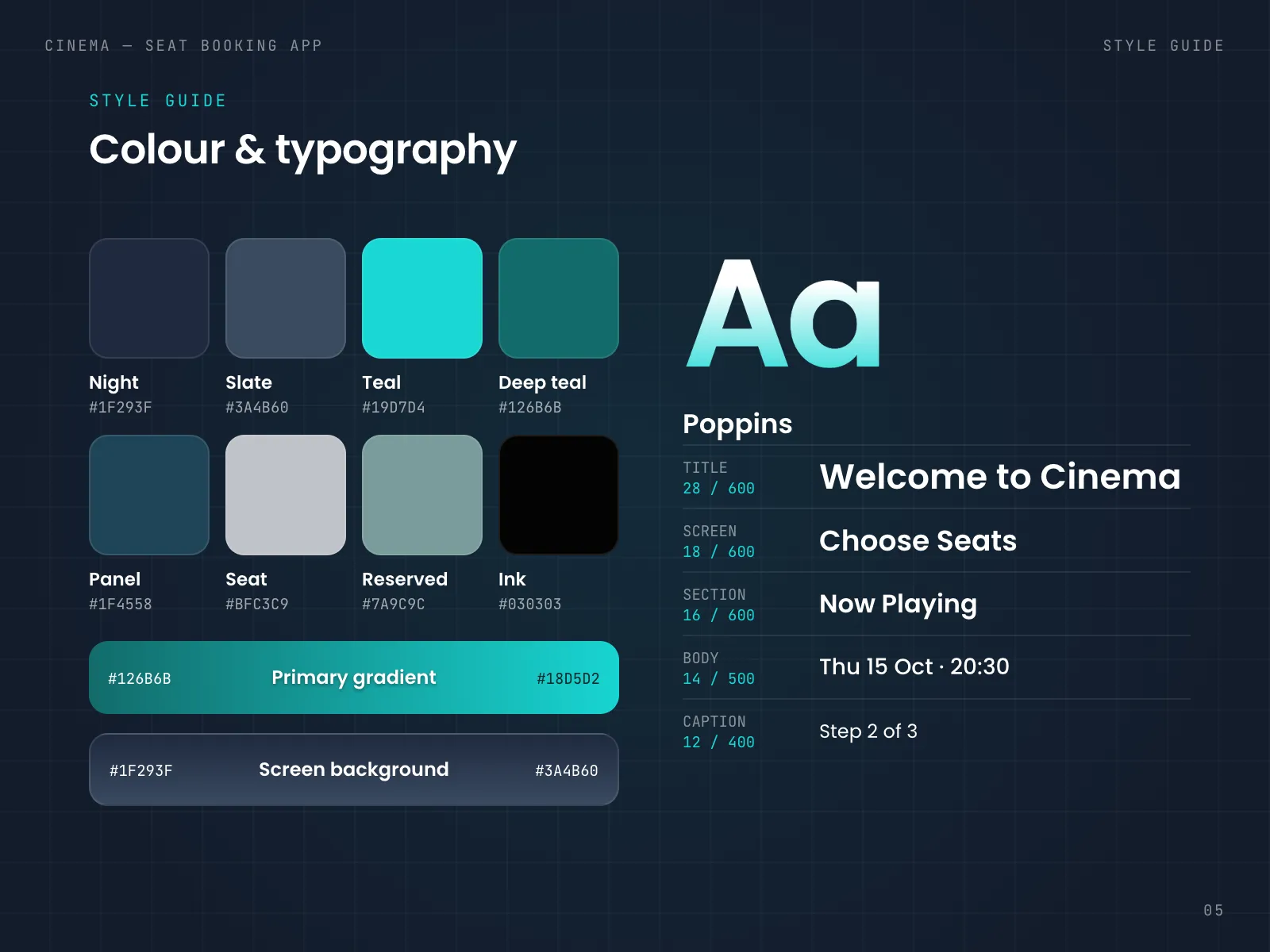
Cinema is used in the dark, so the base is Night (#1F293F) fading into Slate, and there are no white backgrounds anywhere. Teal (#19D7D4) means only two things: you can tap this, or you picked this. That's why the selected date, the selected time, your seats and the Book button all share it. The seats are a light grey (#BFC3C9), so they are brighter than everything except your own picks. Everything is set in Poppins, at 600 for titles, 500 for body text and 400 for captions, because its round, open letters stay readable at 12 px on a dark screen.
05
Final screens
06
Next steps
Next, I'd test the seat map on a real phone in a dark room, with the brightness turned down, to see if free and taken seats still read at a glance. I'd also check whether people understand 8:00 as minutes left. Then I'd add group booking, so friends can pick seats together and each pay for their own.
Next project