Flight booking app · Personal project
Embark with Ease
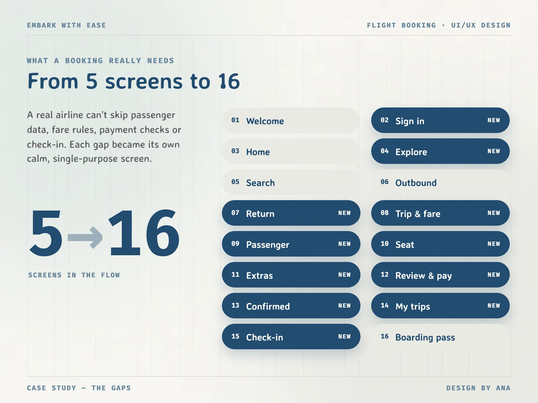
Embark with Ease is an iOS app for booking a flight, from the first search to the boarding pass. I took five screens I had designed earlier, listed everything a real booking needs, and grew them into sixteen.
- Role
- UX audit, UI design, prototype
- Platform
- iOS mobile app
- Scope
- 16 screens, design system
- Year
- 2024
01
The challenge
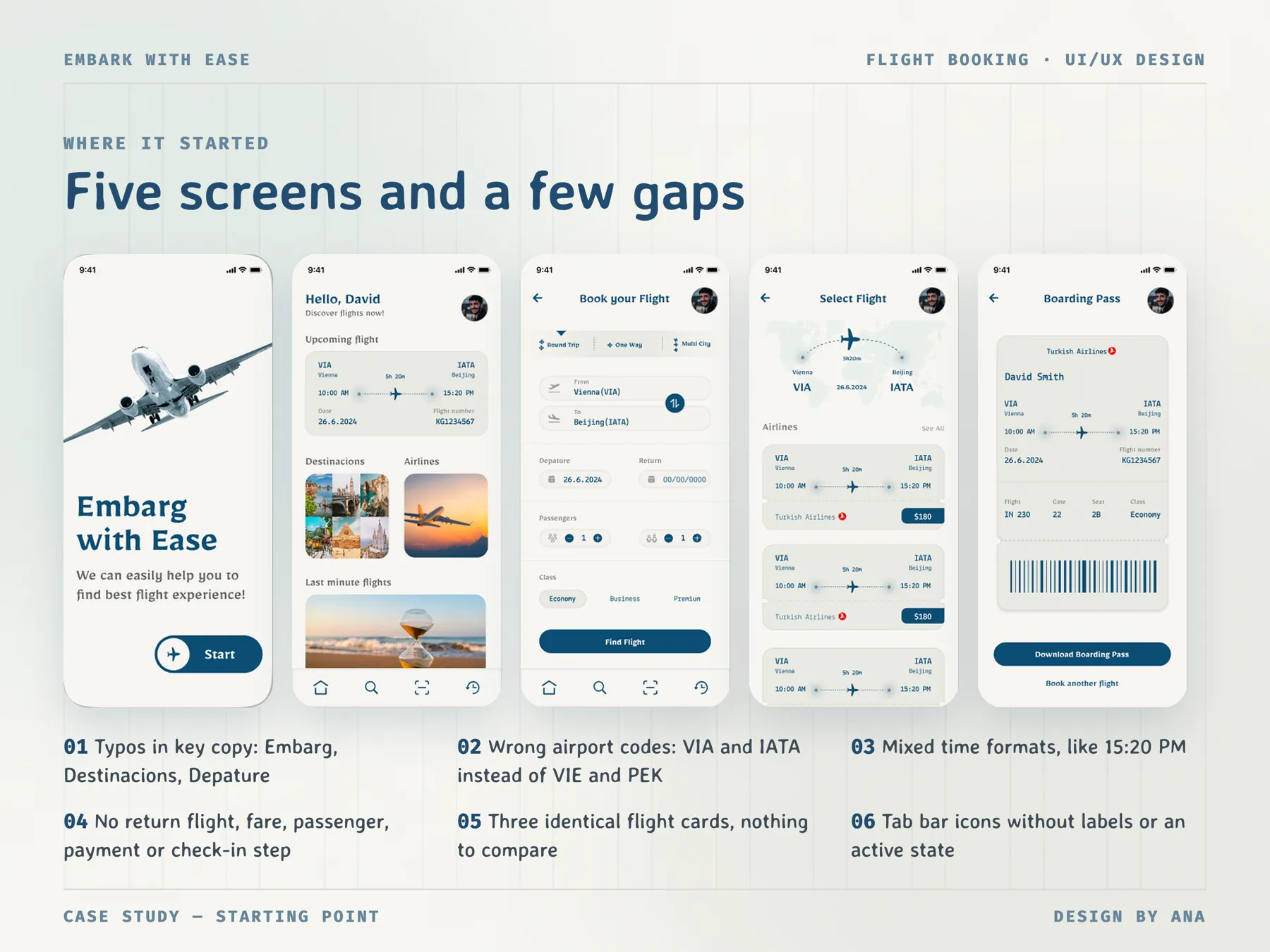
My first version had five screens: welcome, home, search, a list of flights and a boarding pass. They looked tidy, but when I went through them again step by step, you could pick a flight and land straight on the boarding pass. There was no return flight, no fare, no passenger details, no payment and no check-in. The small things were wrong too: VIA and IATA instead of VIE and PEK, times like 15:20 PM, and typos like Embarg and Depature. In an app that gets my passport number and my money, mistakes like these would make me doubt everything else.
Half a booking
You could go from the flight list to a boarding pass with nothing in between.
Three cards, no choice
The flight list showed three identical cards, so there was nothing to compare.
Wrong details
Wrong airport codes, mixed 12 and 24 hour times and typos in the key copy.
Icons only
The tab bar had four icons with no labels and no active state.
02
User flow
- 01Search
- →
- 02Outbound & return
- →
- 03Fare
- →
- 04Details
- →
- 05Seat
- →
- 06Extras
- →
- 07Payment
- →
- 08Check-in
- →
- 09Boarding pass
03
Key decisions
- 01
Fix the details first
Before adding anything, I fixed what was already there. Vienna became VIE and Beijing PEK, every time is in 24 hour format, and the typos are gone. The tab bar now has labels, Home, Explore, Scan and Trips, and the active tab is marked. None of this shows in a before and after picture, but a booking app that gets an airport code wrong loses my trust straight away.
- 02
One job per screen, four steps on top
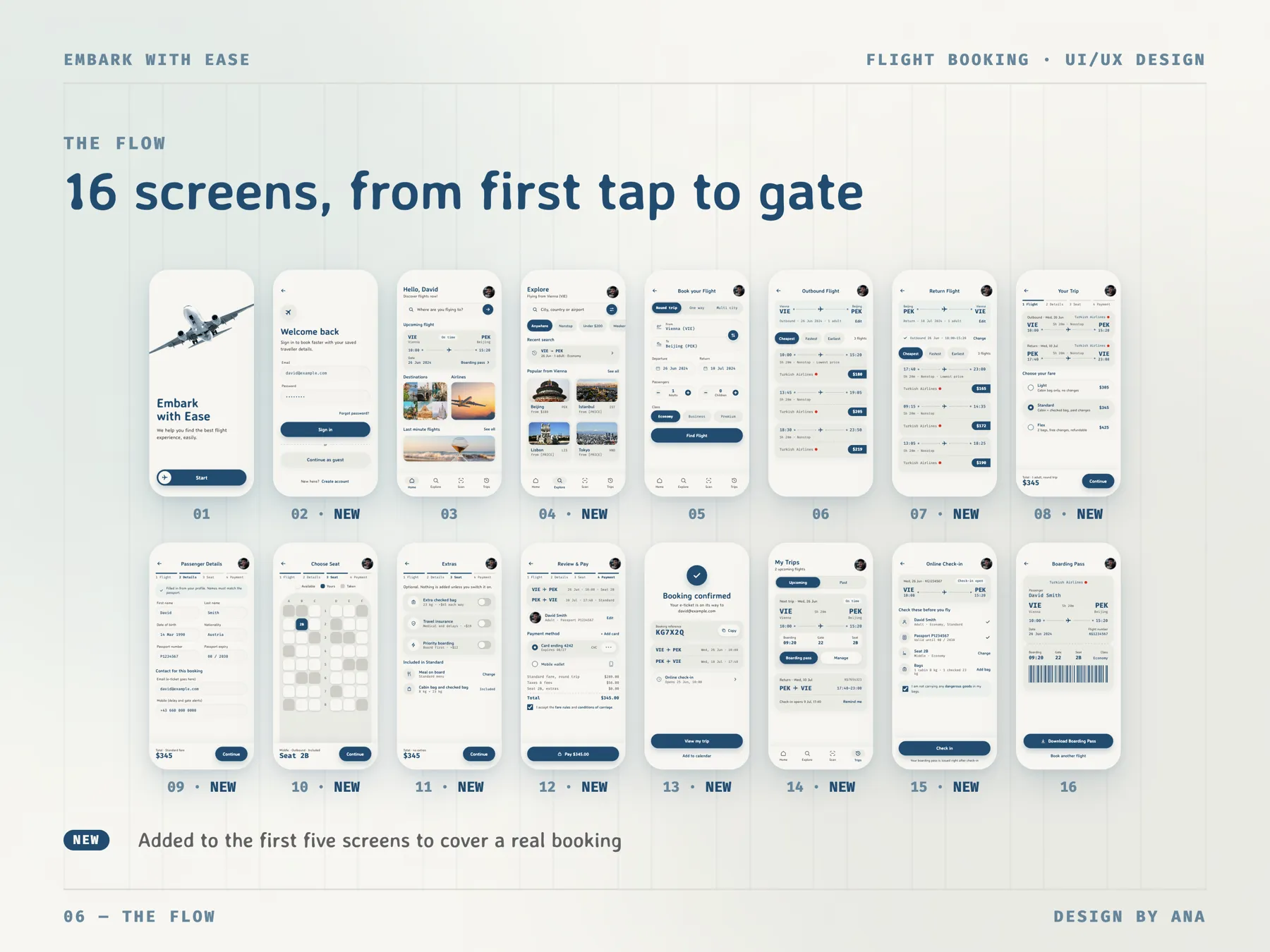
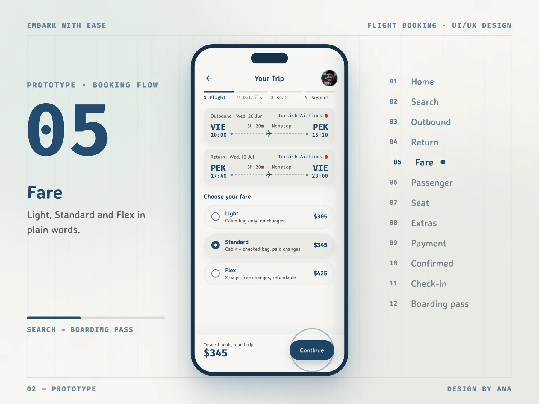
Sixteen screens is a lot, so every booking screen does one thing: pick the fare, fill in the passenger, pick a seat, add extras, pay. Above them a bar shows four steps, Flight, Details, Seat and Payment, so the sixteen screens feel like four. The cost is more taps than one long form. To make those taps easy, Continue is always in the same place, bottom right.
- 03
The total never leaves
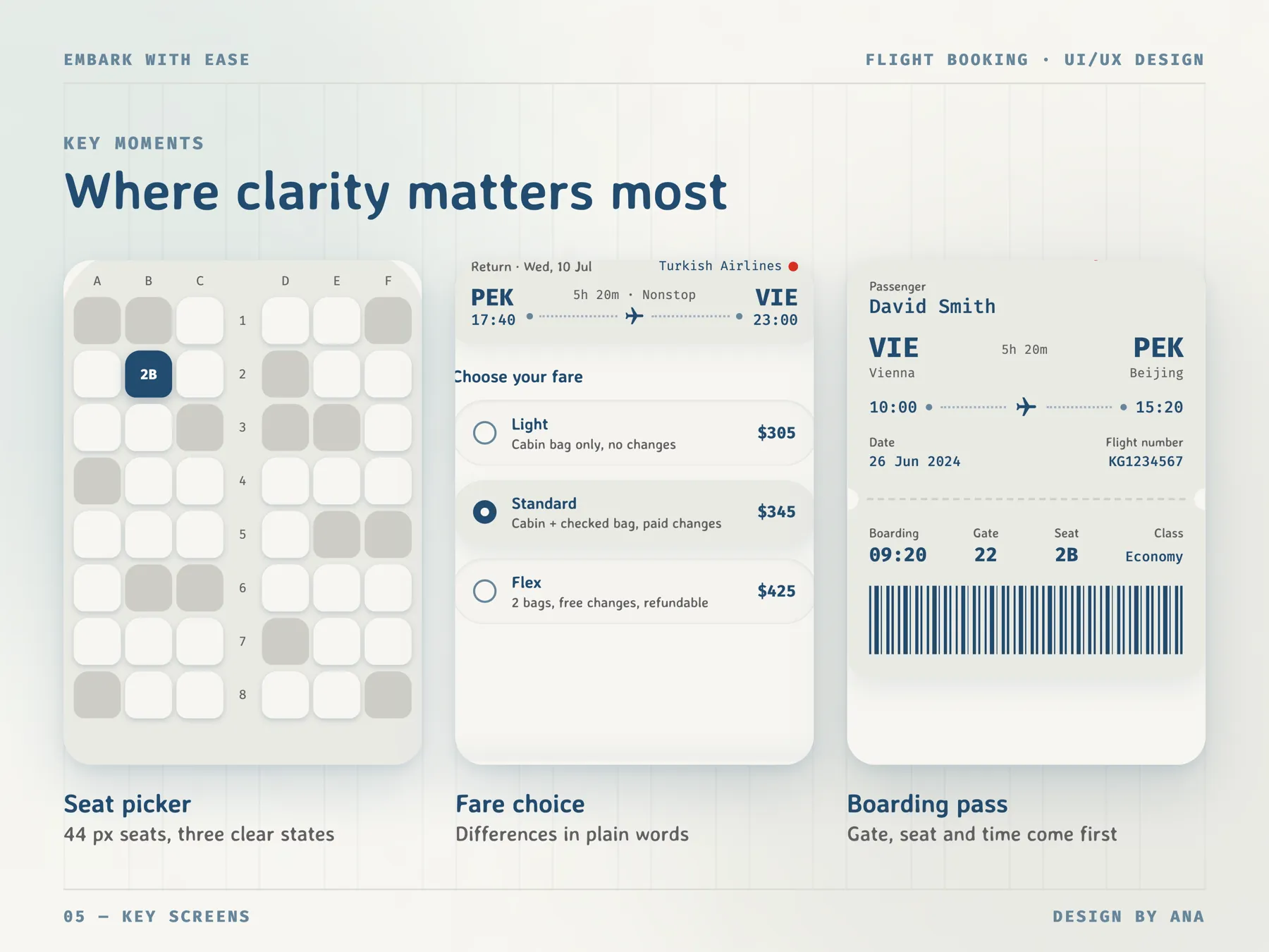
On every booking screen the bottom bar shows the total and what it covers, like Total · 1 adult, round trip $345. On the seat screen it shows Seat 2B instead, and on Extras it says no extras, so you see what changed. The bar takes some height on each screen, but these screens are short anyway. It means the number at Review & Pay is never a surprise.
- 04
Flights you can actually compare
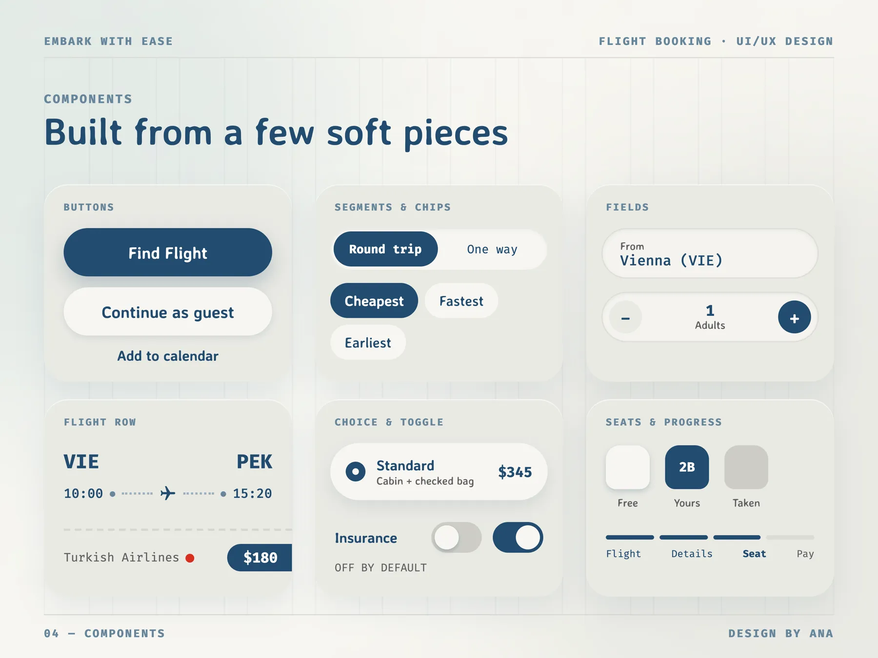
Search keeps the departure and return dates side by side, with Round trip, One way and Multi city on top. The flight list got three chips, Cheapest, Fastest and Earliest, and each row shows the times, the duration, Nonstop and the price in a navy pill. When you pick the return flight, the outbound one stays on top with a tick and a Change link. Picking outbound and return separately adds a screen, but you never lose sight of your first choice.
- 05
Fares in one line each
Light, Standard and Flex each get one line of plain words: Cabin bag only, no changes. Cabin + checked bag, paid changes. 2 bags, free changes, refundable. The prices sit in one column on the right, in the mono font, so you compare by reading down. One line can't hold every fare rule, so the full rules come at Review & Pay, where you accept them with a checkbox before the Pay button.
- 06
Extras stay off
The Extras screen starts with Optional. Nothing is added unless you switch it on. Extra checked bag, Travel insurance and Priority boarding are toggles that start off, and under them is what your fare already includes, so nobody pays twice for a bag. An airline would probably sell more with some of these switched on. I chose the version where the total only goes up when you decide it should.
04
Design system
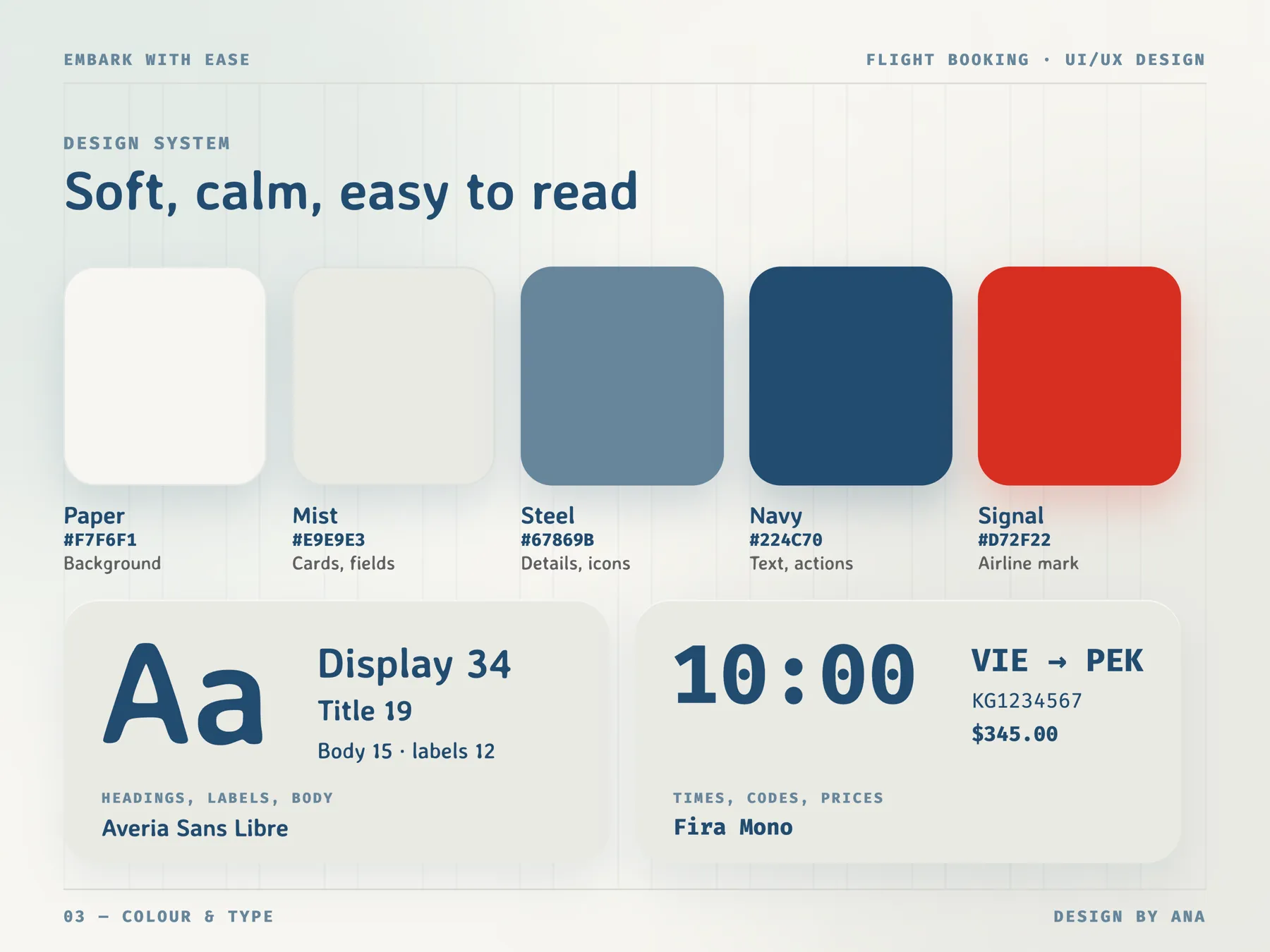
I wanted booking to feel calm, so the palette is five soft colours: Paper for the background, Mist for cards and fields, Steel for details and icons, Navy for text and actions. Signal red appears only as the small airline mark, so it doesn't get confused with an error. Headings and body text are in Averia Sans Libre, whose soft, slightly uneven letters make the app feel friendly. Times, airport codes, flight numbers and prices are in Fira Mono, so 10:00, VIE and $345 line up neatly and are quick to find. Buttons, chips and fields are all pills, the same shape on every screen, so you learn fast what you can tap.
05
Final screens
06
Next steps
Next, I'd test the fare screen with real people and see if one line per fare is enough to choose. I'd also design what happens when things go wrong: a delayed flight, a cancelled one, and rebooking from My Trips. And I'd check whether sixteen screens feel long when someone books in a hurry.
Next project