AI procurement web app · Freelance project
MARE
MARE is an AI web app for construction companies. It matches a project's material list with supplier catalogues, turns it into orders, and checks every supplier invoice against what was ordered. I worked on it as a freelancer in 2025: I led the UX from the first flows and set the UI direction in colour.
- Client
- MARE · freelance
- Role
- UX lead, UI direction
- Platform
- Web app
- Year
- 2025
01
The client and the problem
A construction project orders hundreds of items from several suppliers. The list usually lives in Excel, and someone matches every line by hand against supplier catalogues, by name, size and price. When the invoices come in, the same person checks them line by line against what was ordered. MARE wanted AI to do the matching. My job was to make that something a buyer would actually trust with real money. I designed both journeys from the first wireframes, took the key screens into colour, and then went on maternity leave. The team carried on from those designs.
The same item, ten names
Rebar 12/6 on the site list is Steel reinforcement rebar B500B 12 mm × 6 m in one catalogue and something else in the next.
Trusting a machine with money
If people can't see why the AI picked something, they check everything again and the tool saves nothing.
Invoices checked line by line
Forty lines can hide one wrong price, and finding it takes an afternoon.
Leftovers get lost
Items without a good match fall between spreadsheets and turn up missing on site.
02
User flow
- 01Upload the list
- →
- 02Project & suppliers
- →
- 03AI matching
- →
- 04Choose or mark open
- →
- 05Review by supplier
- →
- 06Send orders
- →
- 07Check the invoice
03
Key decisions
- 01
The AI suggests, the buyer decides
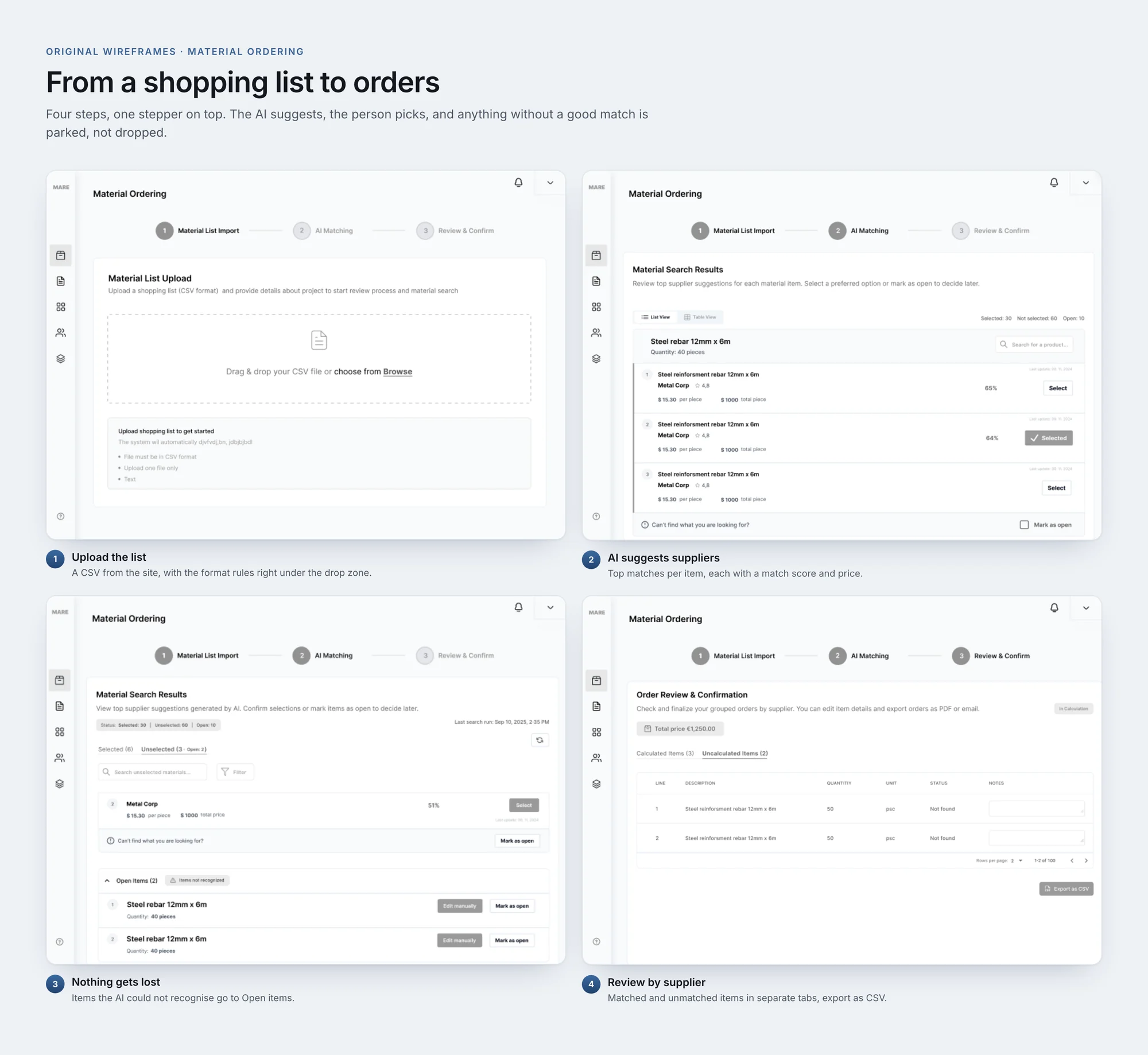
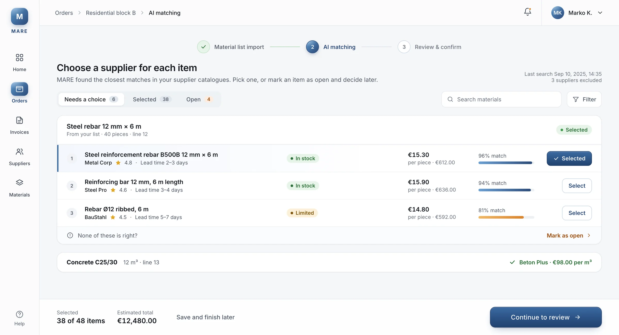
For every item on the list, MARE shows the three closest products from the supplier catalogues, each with a match score, the supplier's rating, stock and lead time. Nothing is ordered until a person picks it. Matches the AI is very sure about are pre-selected and tagged Auto selected, so a buyer can filter them and check them later instead of clicking forty times. Pre-selection is a risk if people stop looking, so the filters keep auto and manual choices apart, and the totals only count what is selected.
- 02
Show only what needs a look
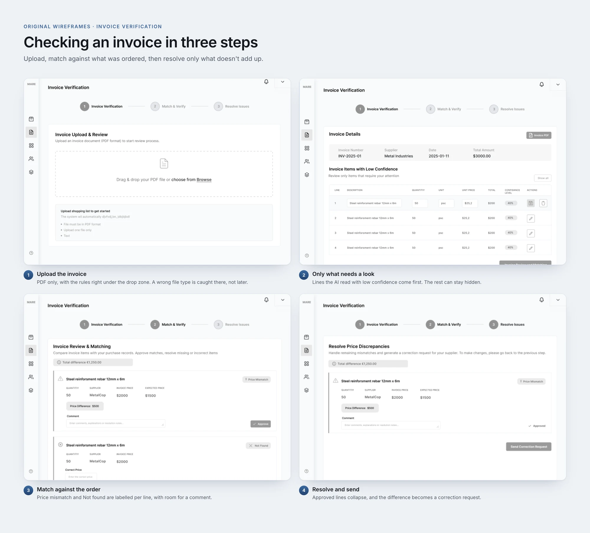
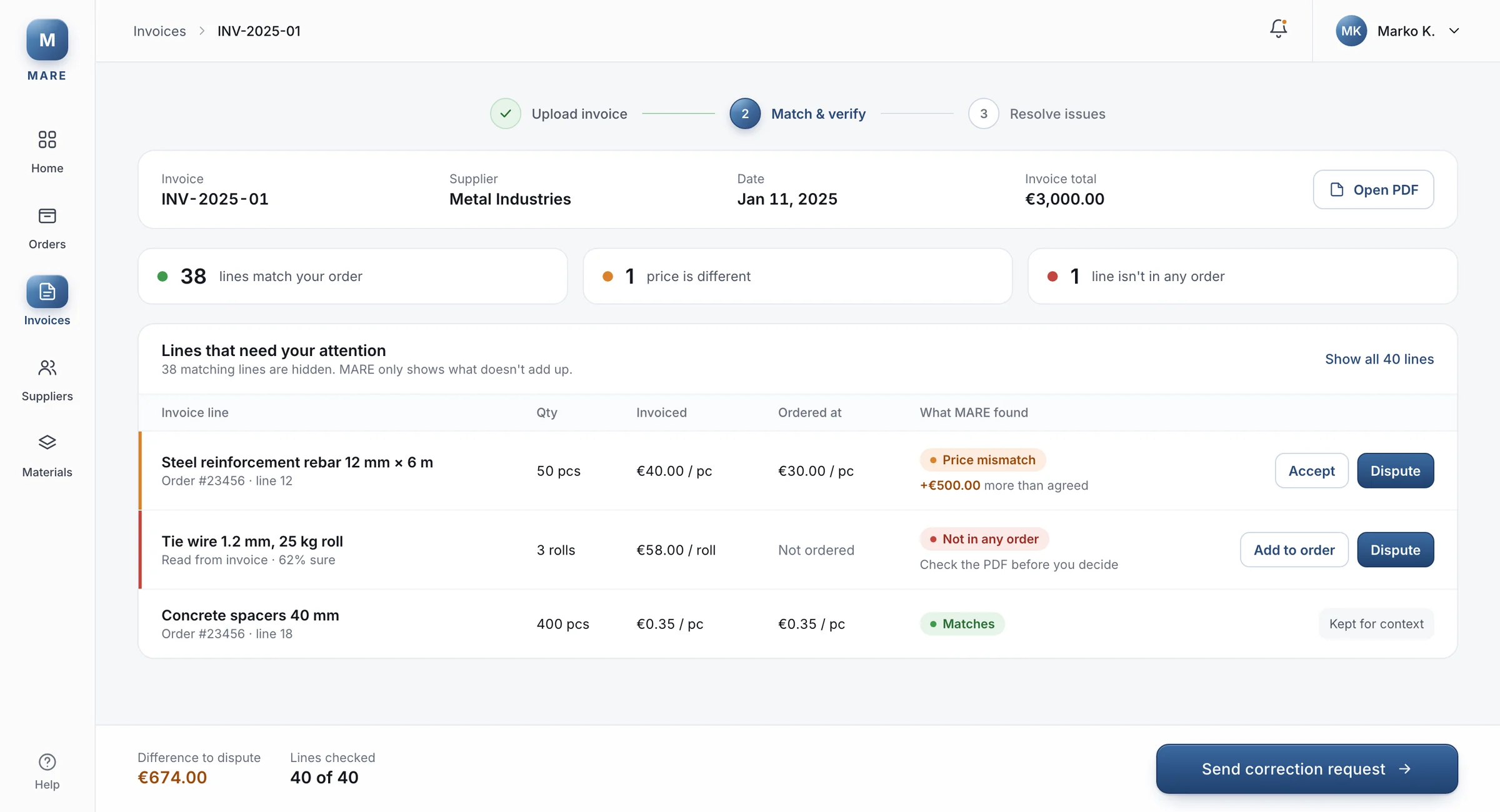
When an invoice comes in, the AI reads every line, but the first screen lists only Invoice items with low confidence. In my wireframes that is four lines out of forty, each with a confidence level, so the buyer checks those first. Hiding lines can feel like losing control, so Show all is always one click away, and the screen says how many lines are hidden.
- 03
Nothing falls out of the list
Some items won't match anything, like a special size or a typo in the list. Under every item there is Can't find what you are looking for? with Mark as open, and items the AI could not recognise collect in Open items, where you can edit them by hand. At review they sit in their own Uncalculated tab and export as CSV. It's one more state to design and explain, but a missing item on a building site costs more than a tab.
- 04
Orders grouped by supplier
Review & confirm groups everything by supplier, MetalCorp and the rest, each with its own total and a line comparing it with the cheapest option, like +€47.00. From there each group goes out as a PDF or an email template, and the buyer marks it as requested with the sum they asked for. Grouping makes it harder to scan the whole list at once, so a total price for the order stays at the top.
- 05
A difference becomes a request
Match & verify puts the invoice price next to the agreed one for every line, with labels like Price mismatch or Not found. A rebar line invoiced at $2,000 instead of $1,500 shows Price difference: $500 straight away. The buyer can approve it with a comment, or leave it, and everything left goes into one correction request for the supplier, with the total difference at the top. Nobody has to write that email from scratch.
- 06
A smaller first version
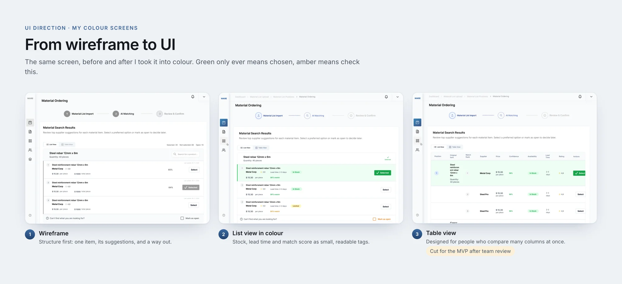
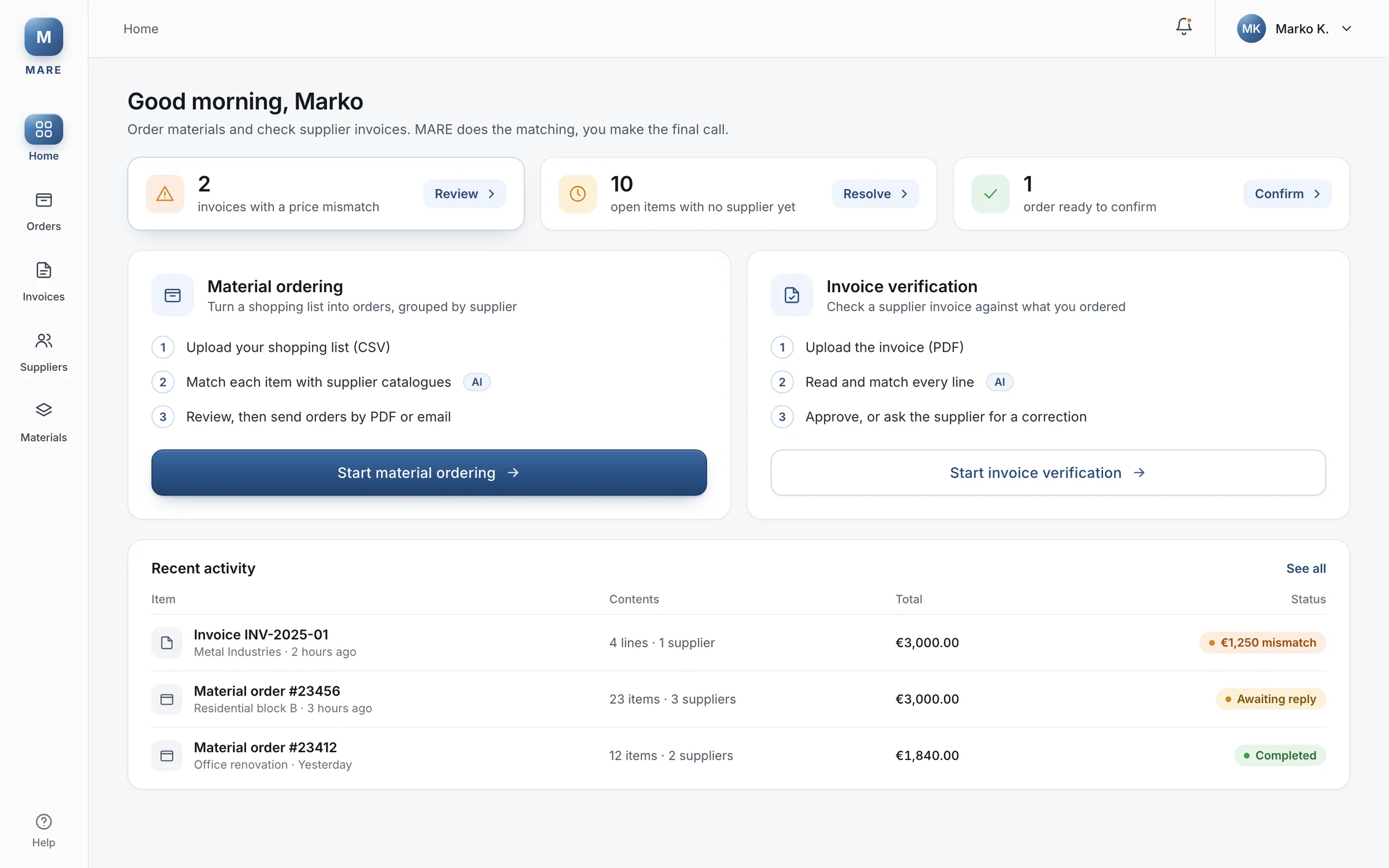
I designed a list view and a table view for the AI results, and a dashboard to start from. In review with the team, the table view and its switch were cut, and the dashboard was marked not needed for the MVP. I agreed: the list already showed stock, lead time and match score, and a first version should prove the matching works before it adds ways to look at it. The cost was that the list had to carry everything, so I spent more time on its hierarchy.
04
Design system
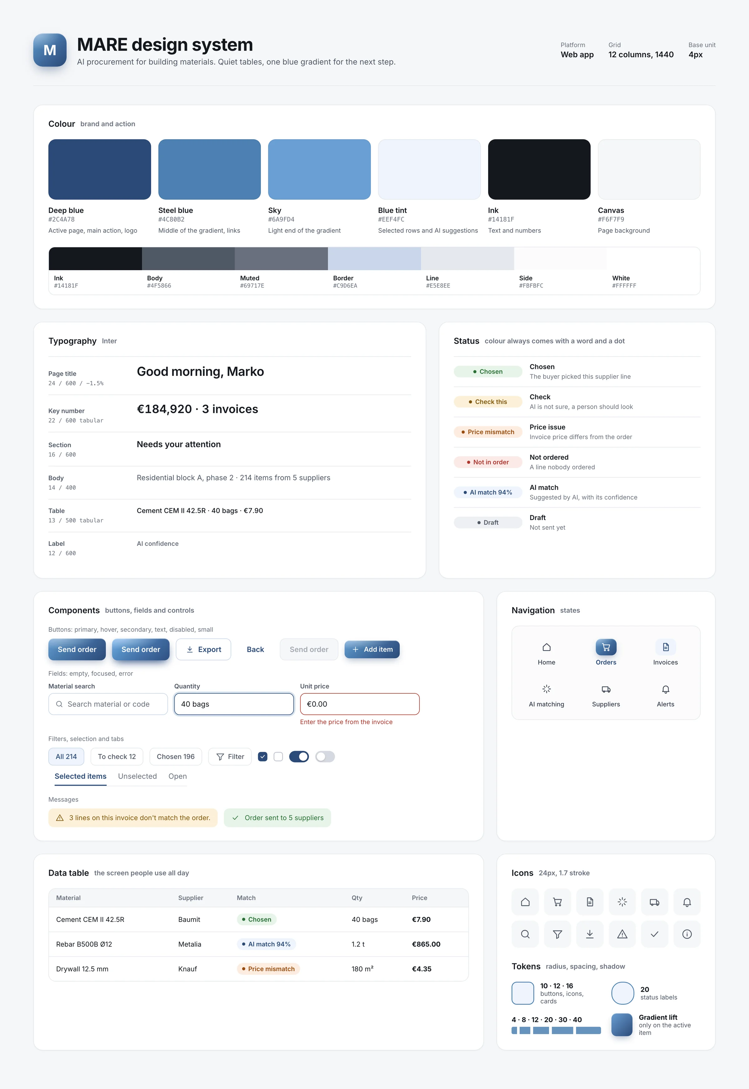
The interface is quiet on purpose, because buyers spend hours in tables. A deep blue gradient appears only on the active page and the main action, so the next step is easy to find. Colour always means one thing: green is chosen, amber means check this, orange is a price problem and red is something that isn't in any order. Status labels have a dot as well as a colour and pass contrast checks at small sizes. Inter carries everything, with tabular numbers so prices line up in a column.
05
Final screens
06
Next steps
Next, I'd look at which AI suggestions buyers overrule most, because that shows where the matching or the screen still needs work. I'd test how sure the AI should be before it pre-selects anything, and bring the table view back only if buyers really compare that many columns.
Next project