Healthy lunch box website · Personal project
Hale
Hale is a website for healthy lunch boxes, cooked fresh every week. I wanted to see if a meal box site could feel as good as a restaurant menu and still let you order a whole week in a few minutes.
- Role
- Brand, UI/UX, motion
- Platform
- Desktop, tablet, phone
- Scope
- 11 sections, 30+ components
- Year
- 2026
01
The challenge
Before I started, I went through a lot of meal box websites. Most of them work the same way. You scroll a long grid of small photos, open other pages to see what's inside, and learn the real price only at checkout, after discounts and delivery. The food is often good. The way it's shown makes choosing lunch feel like reading a spreadsheet.
Too many small photos
Twenty boxes in a grid look alike at thumbnail size. Nothing makes you hungry.
Answers on other pages
Calories, protein and allergens are a click away, so people compare in tabs or guess.
The price comes last
Discounts and delivery are added at checkout, so the number keeps changing.
Health that looks clinical
Bright green on white feels like a pharmacy, not like lunch.
02
User flow
- 01The wheel
- →
- 02Box detail sheet
- →
- 03Plans
- →
- 04Week builder
- →
- 05Totals & delivery
- →
- 06Checkout
03
Key decisions
- 01
One box at a time
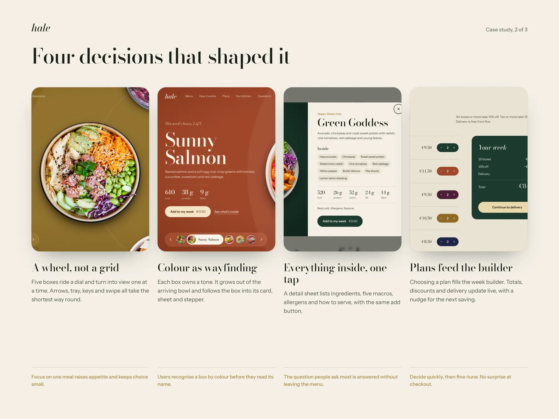
Hale cooks five boxes a week, so it doesn't need a grid. I put them on a wheel with one box in front: big, shot from above, and impossible to miss. Five is few enough to look at one by one. The cost is that you can't compare two boxes side by side, so later the week builder lists all five with their numbers.
- 02
Colour that tells you where you are
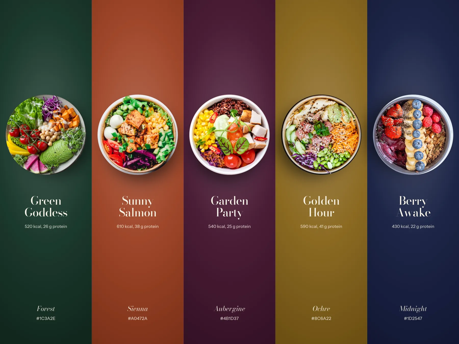
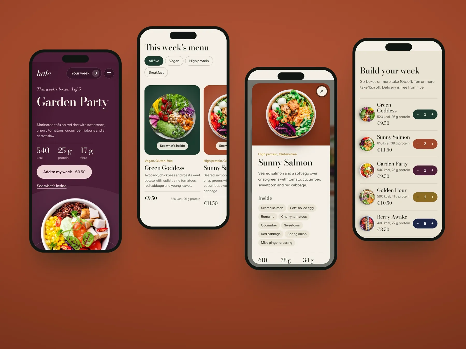
Every box has its own colour, taken from the food: Forest for Green Goddess, Sienna for Sunny Salmon, then Aubergine, Ochre and Midnight. When a box turns into view, its colour fills the page and follows it into the detail sheet and the stepper. After a few turns you know a box by its colour before you read its name. Text on these colours is always ivory, so it stays easy to read on all five.
- 03
Everything inside, one tap away
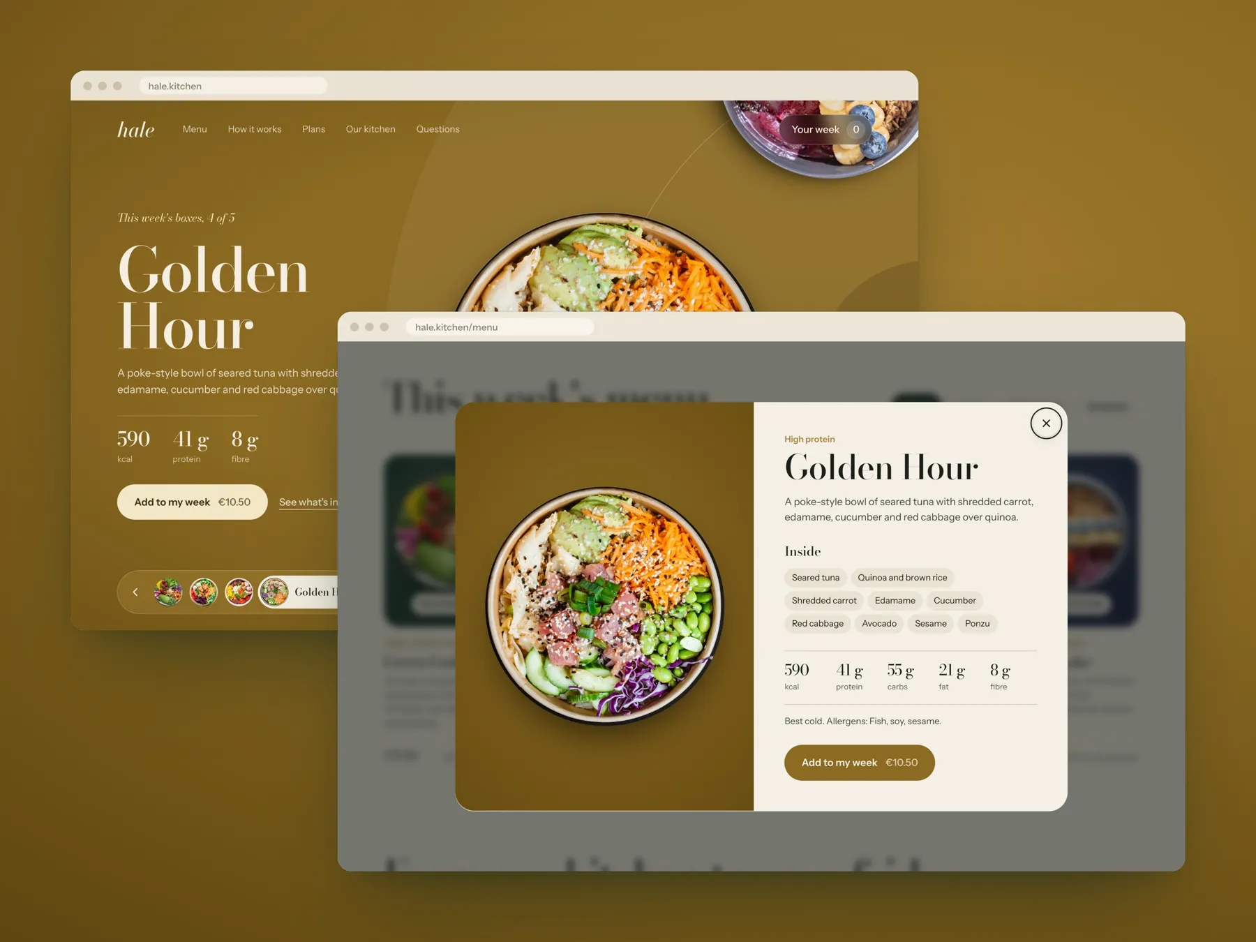
The question people ask most about a lunch box is what's in it. So the answer opens right on the menu, as a sheet over the wheel: ingredients, five macros, allergens and how to serve it, with the same Add button. You never leave the menu, so you never lose your place.
- 04
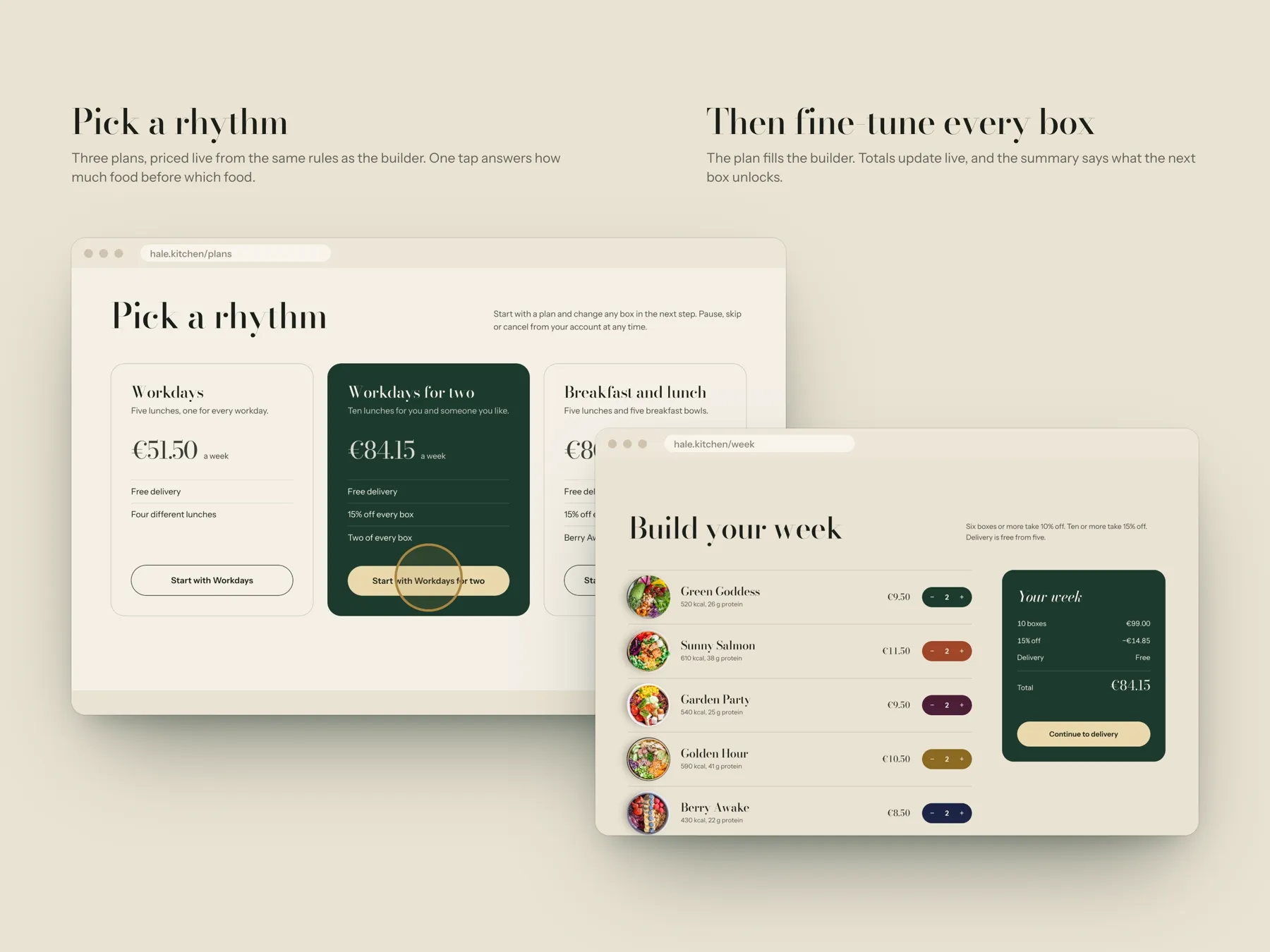
Start with a plan, then change it
Most people don't want to build a week from zero. So first you pick a rhythm: Workdays, Workdays for two, or Breakfast and lunch. The plan fills the week builder, and there you change any box with plus and minus. The total updates on every tap, and a short note tells you how close you are to the next saving.
- 05
One set of rules for every price
Plans, the builder and checkout all use the same rules for prices, discounts and delivery. It sounds like a small thing, but it's what keeps the price from changing at the last step, which is what I liked least on other sites.
- 06
Phone first
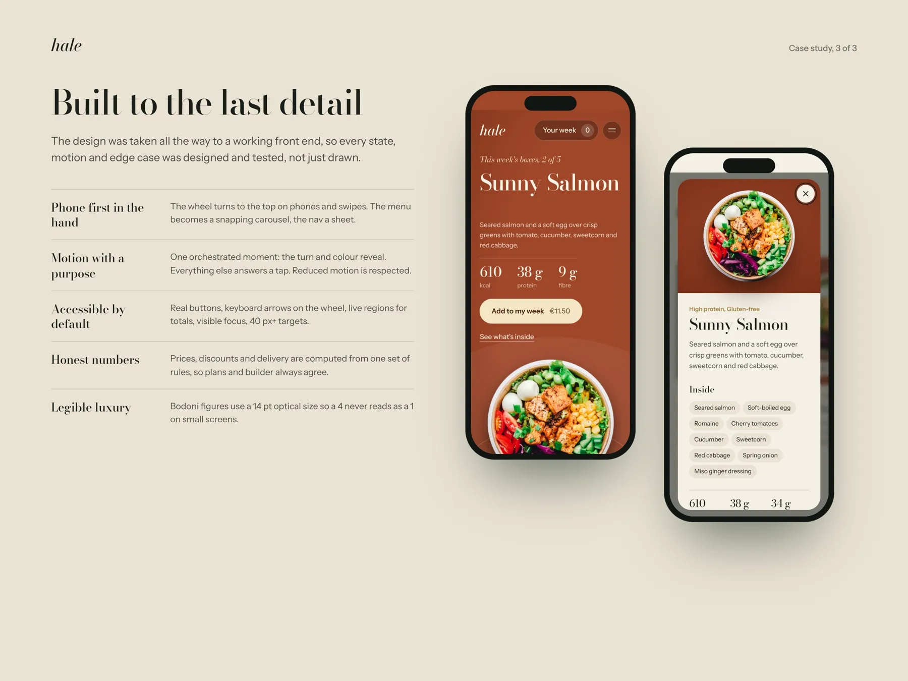
On a phone the wheel moves to the top of the screen and you swipe it. The menu becomes a carousel that snaps into place, and the navigation opens as a sheet. Buttons are at least 40 px, the wheel works with arrow keys, and screen readers hear the new total every time it changes.
04
Design system
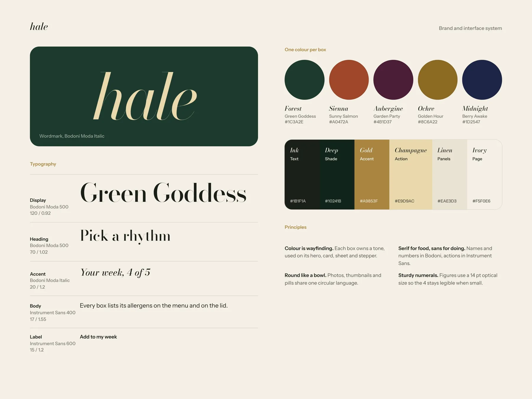
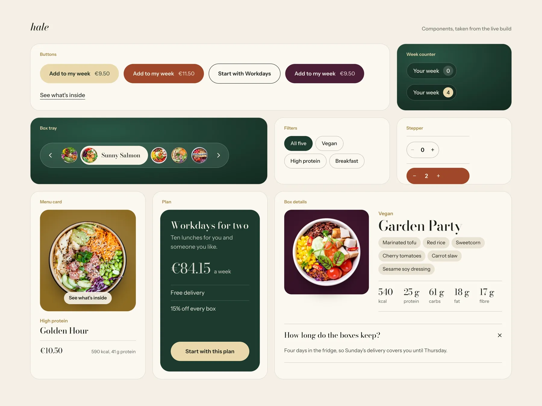
I wanted Hale to feel like a good restaurant, not a health app. Bodoni Moda is for food names and big numbers, because a menu set in a serif feels made with care. On small screens I use a sturdier optical size, so the thin strokes don't break up. Instrument Sans is for buttons and small text. Shapes are round like bowls, and the colours come from the food and sit on ivory and champagne instead of white.
05
Final screens
06
Next steps
Next, I'd test the wheel itself. Does it help people choose, or would a simple list of five be faster? I'd give both versions to a few people and time how long it takes them to fill a week. I'd also check that the colours still work when the menu changes every week.
Next project