Smart home dashboard · Personal project
Dusk Home
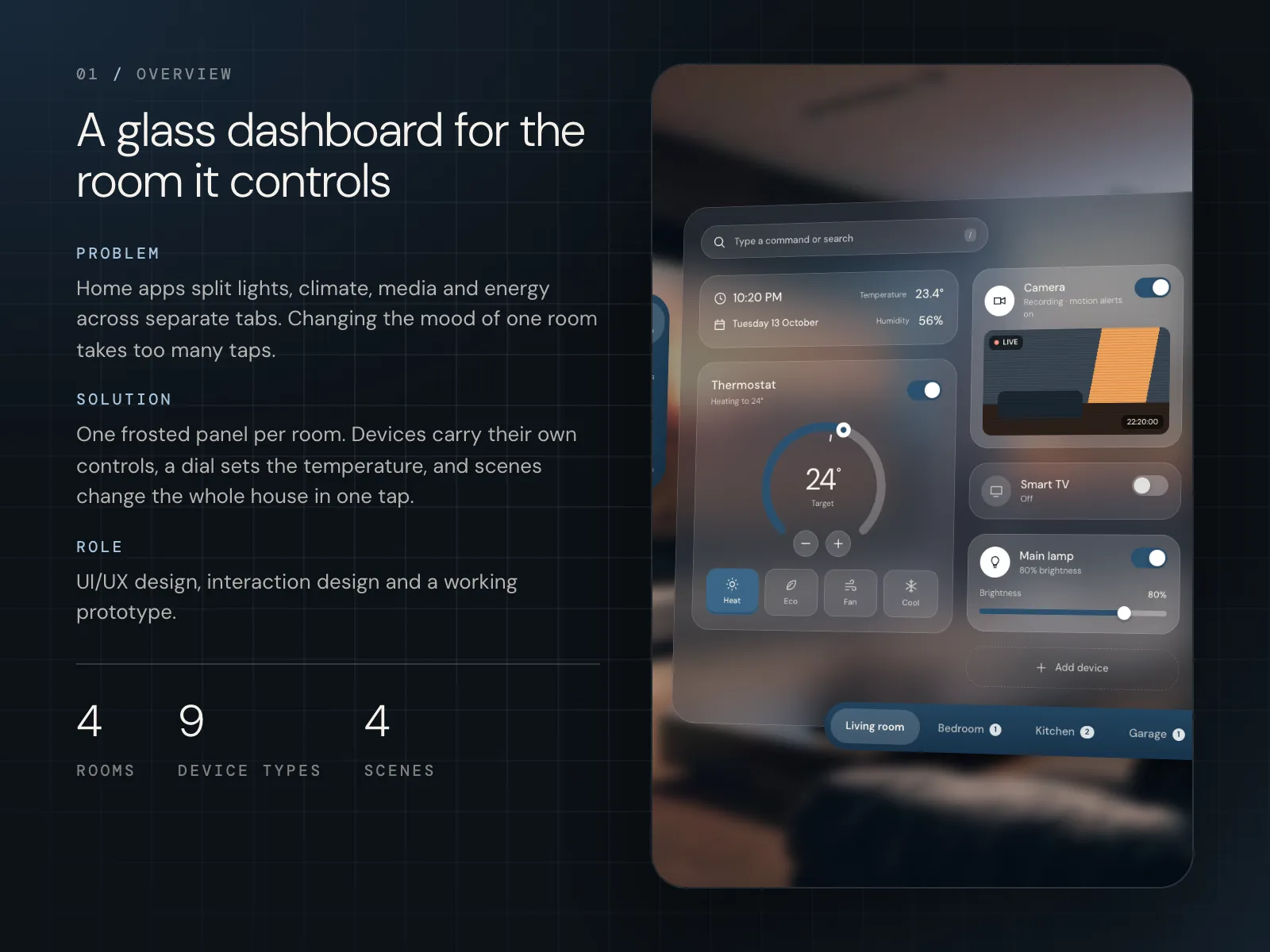
Dusk Home is a smart home dashboard for a wall panel, a tablet and a phone. One frosted glass panel shows the lights, TV, camera, temperature and energy for a room, so you can change the whole room from one screen.
- Role
- UI/UX, interaction design, prototype
- Platform
- Wall panel, tablet, phone
- Scope
- 4 rooms, 9 device types, 4 scenes
- Year
- 2023 · Concept
01
The challenge
When I looked at smart home apps, most of them kept each thing in its own tab: lights in one place, climate in another, energy somewhere else. To get a room ready for a film you dim the lamp, turn on the TV and turn up the heating, and that's three screens. Many of these apps also give every device and state its own bright colour. On a panel that hangs on the wall all evening, that's a lot of noise in a room where people want to rest.
Split into tabs
Devices, temperature and energy each live in a different place.
Too many taps for one mood
Getting a room ready for the evening means visiting several screens.
Hard to read at a glance
It isn't clear what's on right now and what's using power.
Loud on the wall
Bright colours fight with the room the panel hangs in.
02
User flow
- 01Choose room
- →
- 02Device cards
- →
- 03Inline controls
- →
- 04Thermostat
- →
- 05Energy
- →
- 06Scenes
03
Key decisions
- 01
Controls on the card
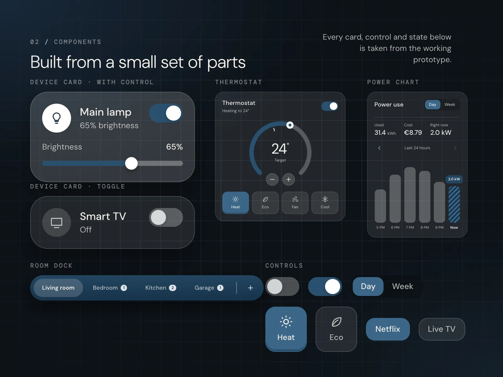
Each device is a card with its own control. Main lamp has a toggle and a brightness slider with the number next to it, 80%. Smart TV only needs a toggle, so its card is shorter and just says Off. Nothing opens a new screen. The cost is space: a card with a slider can't be as small as an icon in a grid, so a room fits only a handful of devices. I put Add device at the end as a dashed card, so it's clear where new ones go.
- 02
A dial for the temperature
A dial felt right for temperature, because people think of it as something you turn up or down. You drag the handle or tap minus and plus, and the big number in the middle shows the target, 24°. Under it are four modes: Heat, Eco, Fan and Cool. The line Heating to 24° under the title says what's happening in plain words, so you don't even need to read the dial.
- 03
Energy as a plain bar chart
Power use starts with three numbers: Used 31.4 kWh, Cost €8.79 and Right now 2.0 kW. Under them, bars show the last 24 hours, and you can switch from Day to Week. The current hour has its own striped bar labelled Now, so it doesn't look like a finished hour. I put the cost in euros next to the kWh, because most people understand money faster than kilowatts.
- 04
Rooms in a dock, scenes for the house
Rooms sit in a dock at the bottom: Living room, Bedroom, Kitchen and Garage. The layout stays the same when you switch, so you always know where things are. Scenes cover what one room can't. Movie night sets the lights down to 20%, turns the TV on and closes the blinds. Good night turns off lights, TVs and speakers, locks the doors and sets the heating to eco at 19°. A scene changes a lot at once, so each card spells out what it does before you tap it.
- 05
One shell for every section
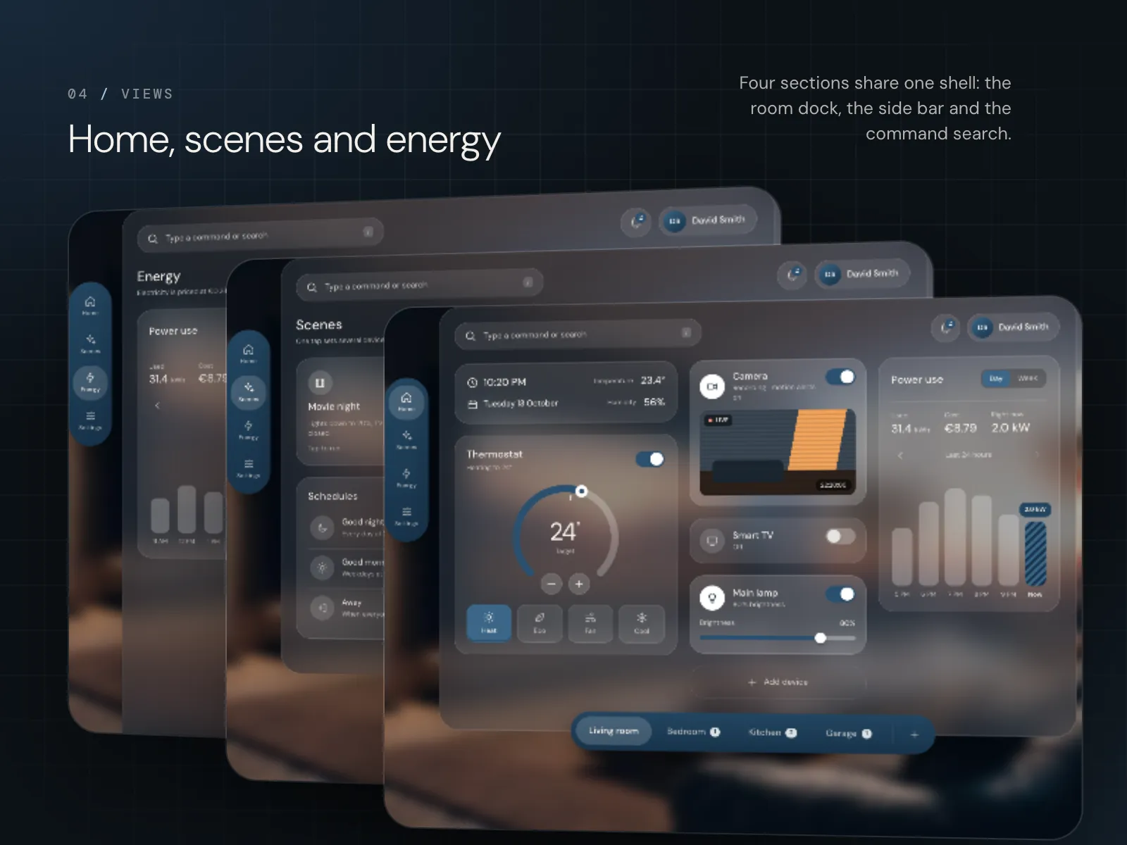
Home, Scenes, Energy and Settings share one shell: the room dock, the side bar and the command search at the top. The search box says Type a command or search, for people who'd rather type than tap through. Because the shell never moves, the panel on the wall always looks the same and only the middle changes.
- 06
The same panel on a phone
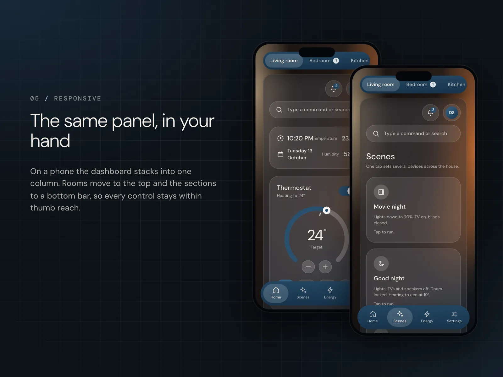
On a phone the dashboard stacks into one column. Rooms move to the top and the sections to a bottom bar, so every control stays within thumb reach. The cards keep the same controls as on the wall, so there's nothing new to learn. The cost is scrolling. On the wall you see the whole room at once, and on the phone you scroll past the thermostat to reach the lamp.
04
Design system
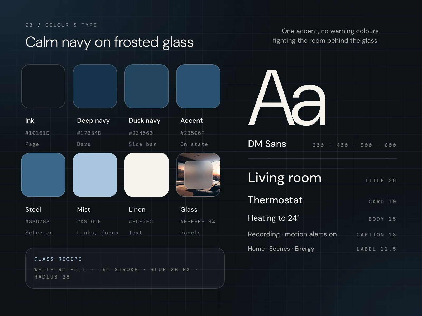
I wanted the panel to sit quietly in the room, so it's frosted glass over the room behind it: white at 9%, a 16% stroke, a 28 px blur and 28 px corners. There's one accent, a navy (#2B506F), and it only means on. A toggle that's on or the room you're in turns navy, so you can see what's running from across the room. A lighter steel blue marks what's selected, like the Heat mode. There are no warning colours, because red and orange would fight with the room behind the glass. All text is DM Sans in four weights, light enough to look calm and clear enough to read from a few steps away.
05
Final screens
06
Next steps
Next, I'd put the prototype on a real wall tablet and live with it for a few evenings. I'd check that the glass stays readable when the room behind it is bright, and that the navy on state is clear from a few steps away. I'd also design alerts, like motion on the camera, that get noticed without making the panel loud.
Next project